When teaching about regression it can be useful to visualize the data as a point plot with the
outcome on the y-axis and the explanatory variable on the x-axis. For regression models, this is
most easily achieved by calling ggformula::gf_lm(), with empty models
ggformula::gf_hline() using the mean, and a more complicated call to
ggformula::gf_segment() for group models. This function simplifies this
by making a guess about what kind of model you are plotting (empty/null, regression, group) and
then making the appropriate plot layer for it.
Usage
gf_model(
  object = NULL,
  gformula = NULL,
  data = NULL,
  ...,
  model,
  xlab,
  ylab,
  title,
  subtitle,
  caption,
  geom = "model",
  stat = "model",
  position = "identity",
  show.legend = NA,
  show.help = NULL,
  inherit = TRUE,
  environment = parent.frame()
)
Arguments
- object
A plot created with the
ggformulapackage.- gformula
Not used.
gf_model()draws a model, not an aesthetic formula; a model given positionally lands here and is moved tomodel.- data
Not used. The layer draws the model's predictions, which are computed from the data the plot was built from.
- ...
Additional arguments. Typically these are (a) ggplot2 aesthetics to be set with
attribute = value, (b) ggplot2 aesthetics to be mapped withattribute = ~ expression, or (c) attributes of the layer as a whole, which are set withattribute = value.With no
model, and a plot whose implied shape is a regression line,...also reaches the fitting vocabularyggformula::gf_lm()uses:se = TRUEdraws the confidence bandgf_lm()callsinterval = "confidence",n =sets the prediction grid's length, andmethod.args =isgf_lm()'slm.args =.formula = y ~ poly(x, 2)fits a curve, written with the literal tokensxandyrather than the plot's own variable names – a one-sidedformula = ~xwould instead be read as a mapping, so it is not this.With a supplied model,
ncontrols the prediction grid andse = TRUEis refused. One additional predictor may be present in the data without being mapped: its categories, or its mean and mean plus or minus one standard deviation, define separate model traces.ggplot2::stat_smooth()'sfullrange = TRUEreaches it too, and draws the line past the data. Whether that is honest is yours to decide and not something this function will decide for you: inside the range the model was fit on, every point the line interpolates has observations on both sides of it, and outside there are none. Extending it says the pattern keeps holding where nothing was measured, which needs a theory or a physical constraint behind it. Nothing about the plot's own axis is such a reason, which is why a wider axis – fromgf_lims(), or from theb0dotgf_b()puts at zero – does not lengthen the line on its own.- model
The model to draw. Either a model already fit by
lm()oraov(), or the formula for one – such asbody_mass_kg ~ species– which is fit against the data the plot was built from. The empty model is writtenbody_mass_kg ~ NULL. The outcome must be named: a one-sided formula such as~speciesnames predictors and no claim, so there would be nothing to draw that you had not described. May be given positionally or asmodel =. Omitted, the model the plot implies is drawn instead: a regression line for a numeric predictor, one group mean per level for a categorical one, and the grand mean when the plot draws only an outcome.gf_model(model)draws the ONE model you named in every panel of a faceted plot;gf_model()draws EACH panel's own implied model – a facetedgf_point(body_mass_kg ~ flipper_length_m | species) %>% gf_model()fits a different line per species, where namingflipper_modelabove would repeat one whole-data fit in every panel.- xlab, ylab, title, subtitle, caption
Labels for the plot.
- geom
Not set by the caller. The geometry is derived from the model.
- stat, position
With a named
model, reach the layer as given, butgf_model()computes the model's predictions before the layer is built. Changing the stat recomputes something else on that prediction grid rather than changing the model's claim, so leave these at their defaults. With nomodel, the sharedstat_model()is used and these are not read.- show.legend
Whether this layer contributes to the legend.
- show.help
Print the layer's own help instead of drawing.
- inherit
Not set by the caller. A named intercept stands alone; other named models inherit compatible plot aesthetics while stating their own predicted outcome. With no
model, the layer states its own positions and does not inherit a color grouping the model never named.- environment
The environment mappings are resolved in.
Value
A ggplot object with the model added. With no model, and a plot
whose positional mapping is an expression rather than a bare variable (shuffle(body_mass_kg),
log(flipper_length_m)), the RETURNED plot is pinned to the values it drew when gf_model()
was called – its data gains a fixed column and its mapping names it, while its axis titles
and everything else about how it reads keep your own words. The plot passed IN is untouched.
Supported plots
gf_model() is built for and tested against plots made with
ggformula::gf_point(), ggformula::gf_jitter(), ggformula::gf_boxplot(),
ggformula::gf_violin() and ggformula::gf_histogram(). Other plots may
work if they map their variables the same way, but they are not tested.
Examples
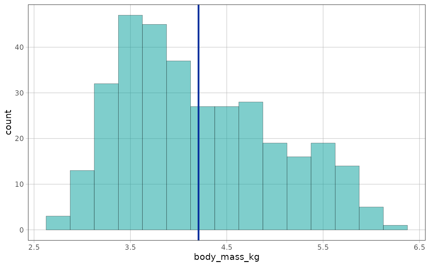
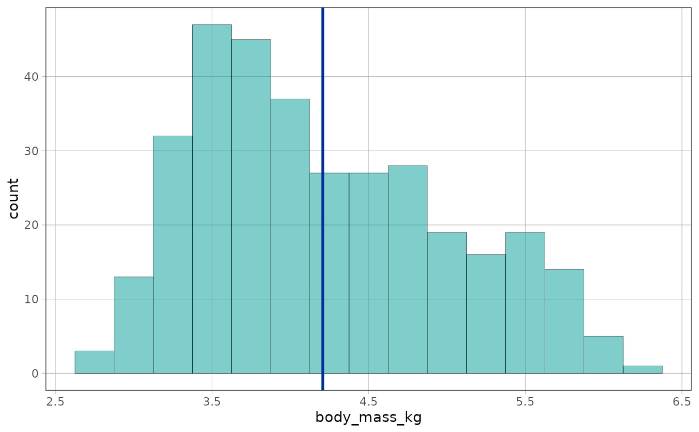
# the empty model predicts the same value (the mean) for every observation
empty_model <- lm(body_mass_kg ~ NULL, data = penguins)
gf_histogram(~body_mass_kg, data = penguins, binwidth = 0.25) %>%
gf_model(empty_model)
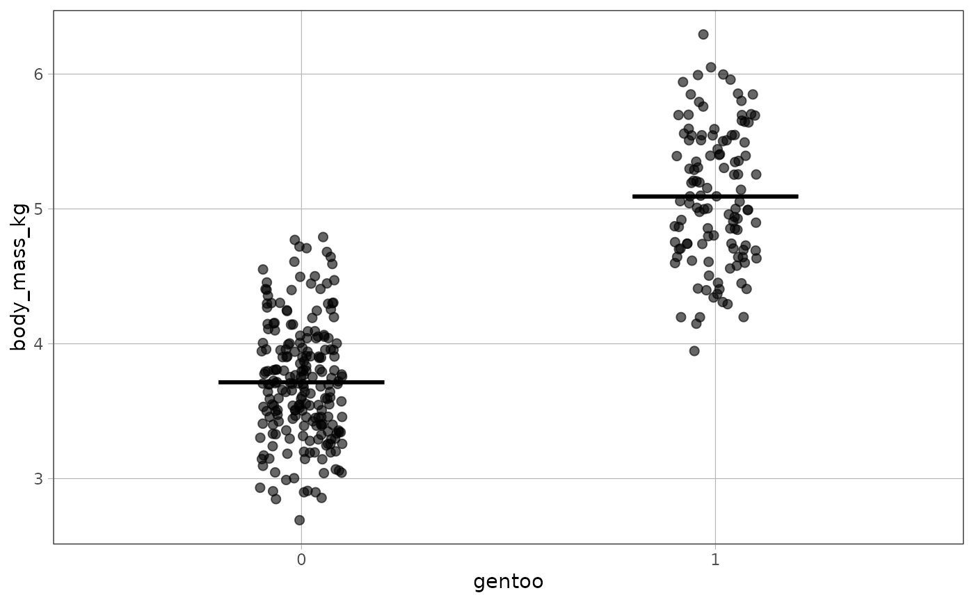
 # a two-group model (categorical explanatory variable) on a jitter plot
gentoo_model <- lm(body_mass_kg ~ gentoo, data = penguins)
gf_jitter(body_mass_kg ~ gentoo, data = penguins, width = .1) %>%
gf_model(gentoo_model)
# a two-group model (categorical explanatory variable) on a jitter plot
gentoo_model <- lm(body_mass_kg ~ gentoo, data = penguins)
gf_jitter(body_mass_kg ~ gentoo, data = penguins, width = .1) %>%
gf_model(gentoo_model)
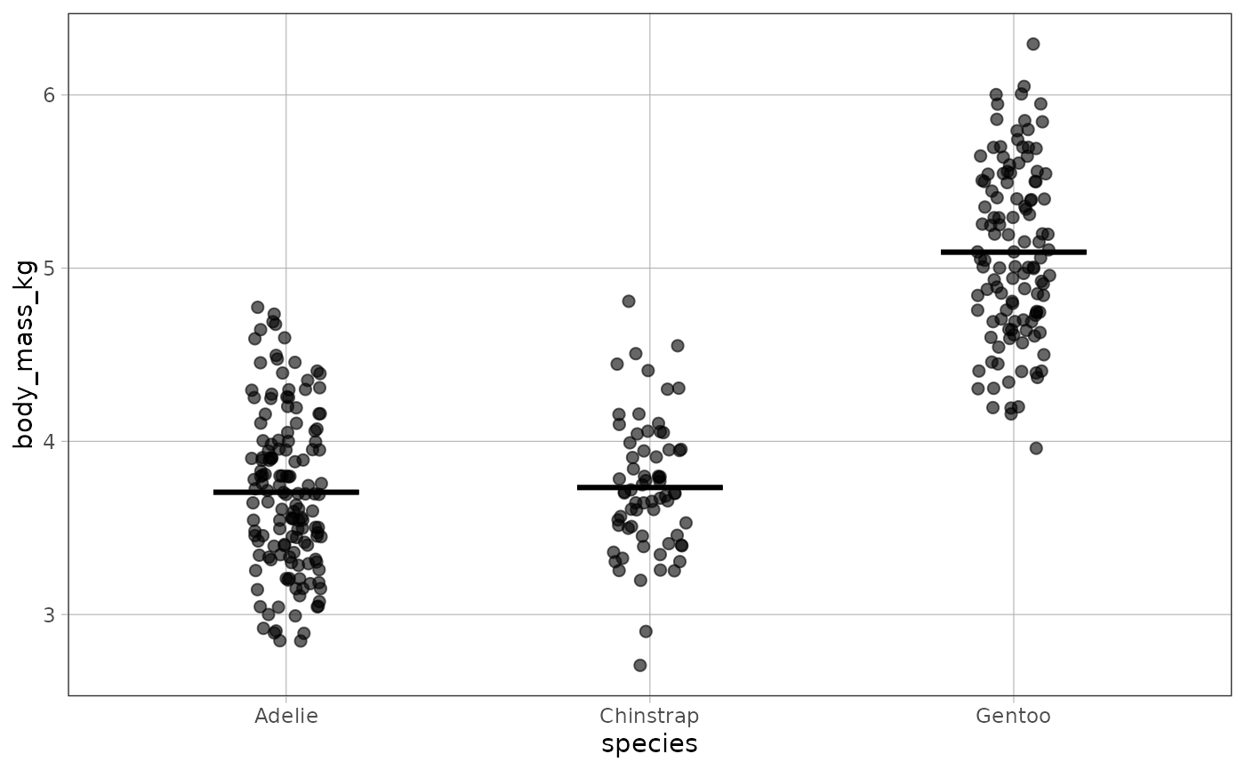
 # a three-group model works the same way
species_model <- lm(body_mass_kg ~ species, data = penguins)
gf_jitter(body_mass_kg ~ species, data = penguins, width = .1) %>%
gf_model(species_model)
# a three-group model works the same way
species_model <- lm(body_mass_kg ~ species, data = penguins)
gf_jitter(body_mass_kg ~ species, data = penguins, width = .1) %>%
gf_model(species_model)
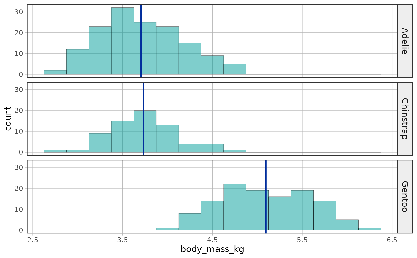
 # group models can also be layered onto faceted histograms
gf_histogram(~body_mass_kg, data = penguins, binwidth = 0.25) %>%
gf_facet_grid(species ~ .) %>%
gf_model(species_model)
# group models can also be layered onto faceted histograms
gf_histogram(~body_mass_kg, data = penguins, binwidth = 0.25) %>%
gf_facet_grid(species ~ .) %>%
gf_model(species_model)
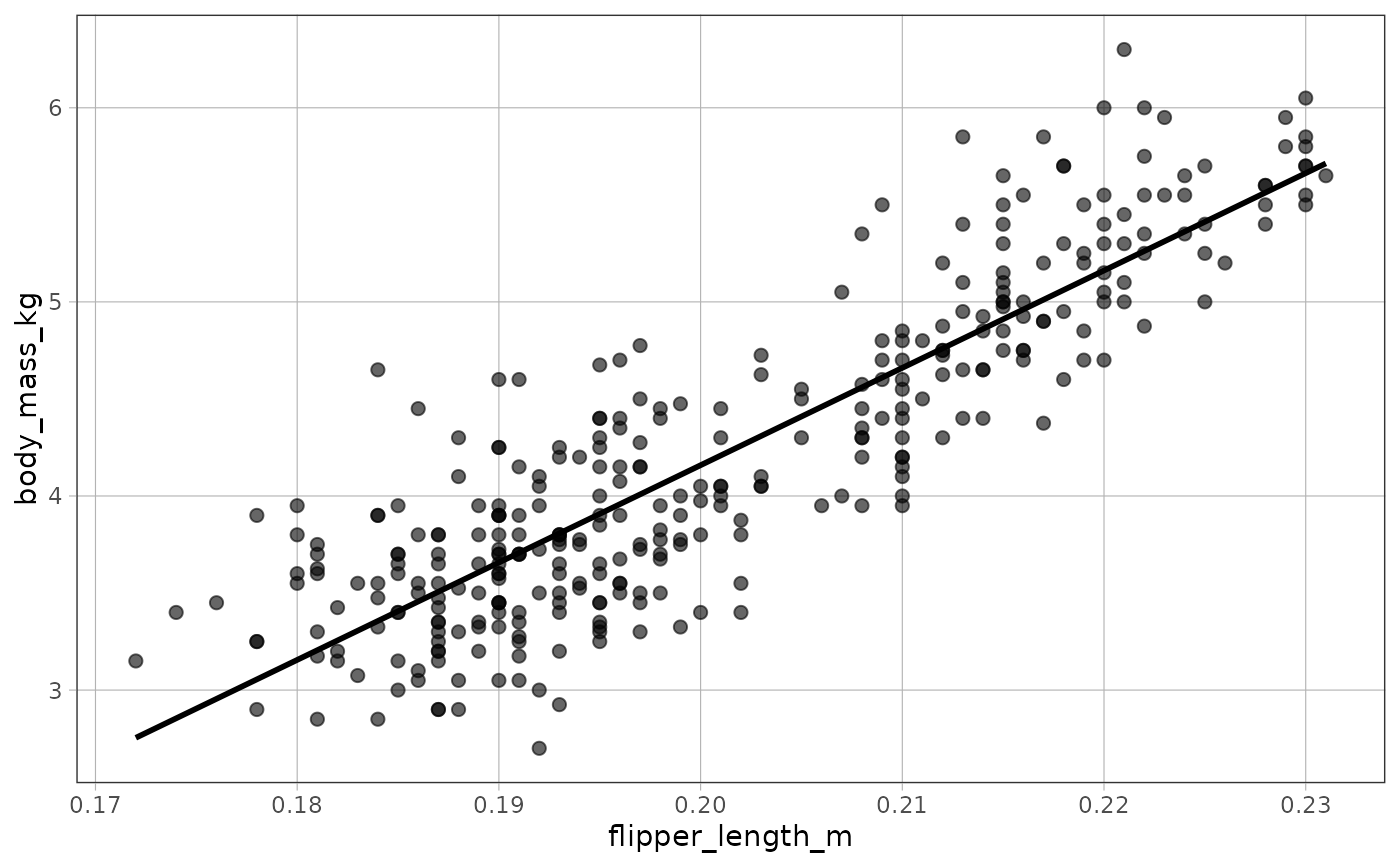
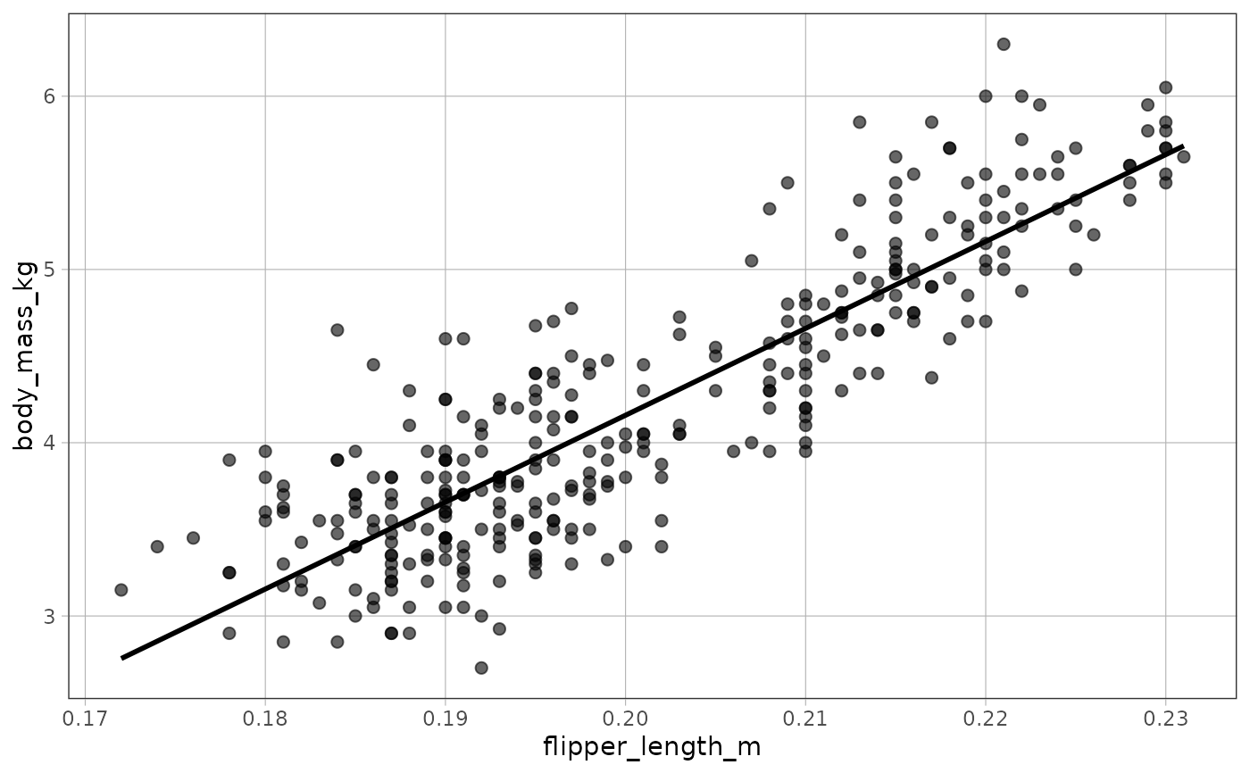
 # a regression model (quantitative explanatory variable) on a scatter plot
flipper_model <- lm(body_mass_kg ~ flipper_length_m, data = penguins)
gf_point(body_mass_kg ~ flipper_length_m, data = penguins) %>%
gf_model(flipper_model)
# a regression model (quantitative explanatory variable) on a scatter plot
flipper_model <- lm(body_mass_kg ~ flipper_length_m, data = penguins)
gf_point(body_mass_kg ~ flipper_length_m, data = penguins) %>%
gf_model(flipper_model)
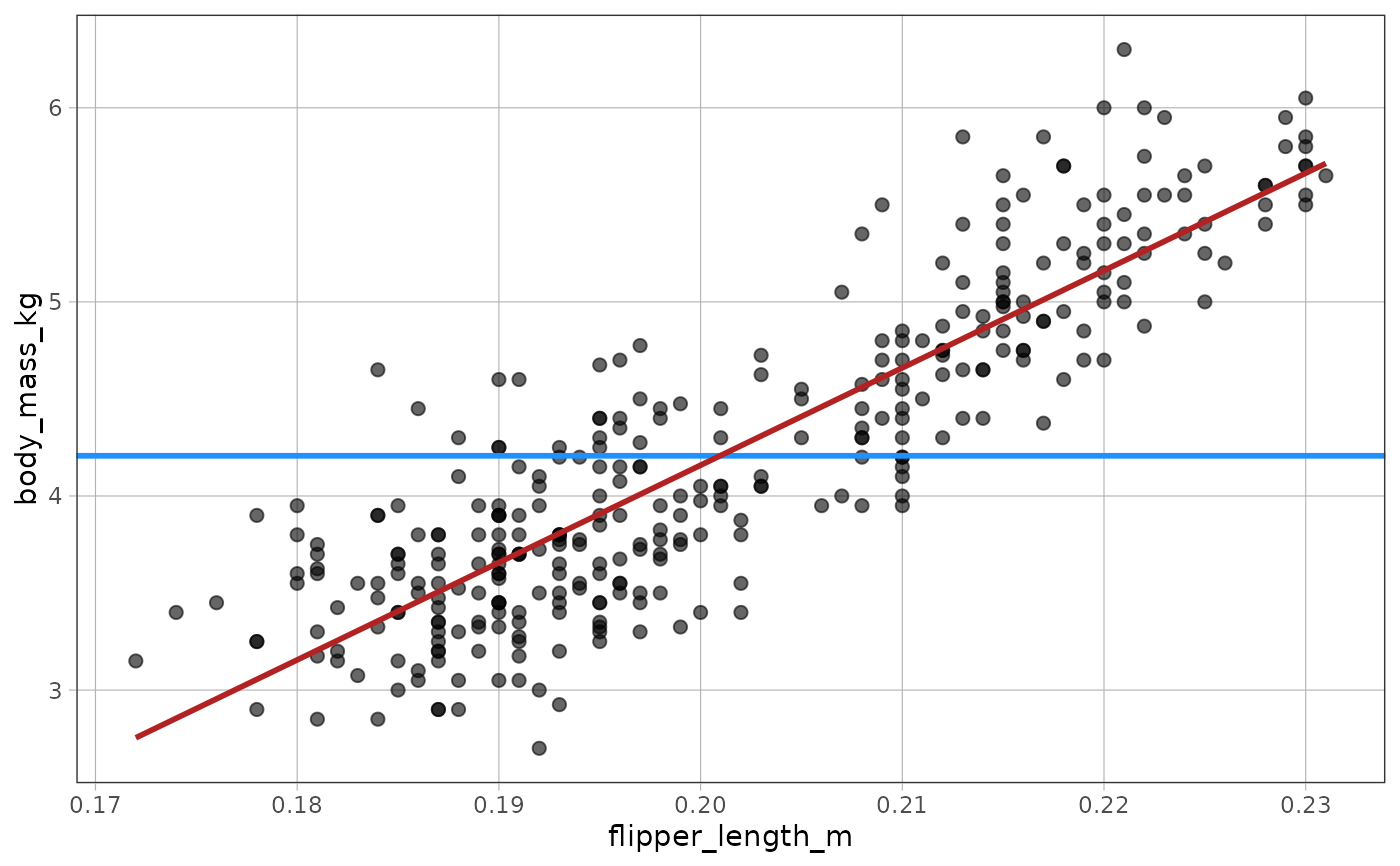
 # layer the empty model and the regression model in different colors to
# compare the two models on the same plot
gf_point(body_mass_kg ~ flipper_length_m, data = penguins) %>%
gf_model(empty_model, color = "dodgerblue") %>%
gf_model(flipper_model, color = "firebrick")
# layer the empty model and the regression model in different colors to
# compare the two models on the same plot
gf_point(body_mass_kg ~ flipper_length_m, data = penguins) %>%
gf_model(empty_model, color = "dodgerblue") %>%
gf_model(flipper_model, color = "firebrick")
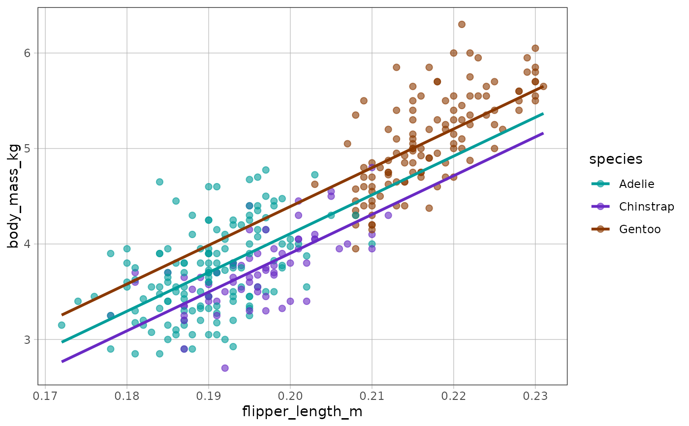
 # with a categorical and a quantitative predictor, the model is drawn
# as one line for each group
ancova_model <- lm(body_mass_kg ~ species + flipper_length_m, data = penguins)
gf_point(body_mass_kg ~ flipper_length_m, color = ~species, data = penguins) %>%
gf_model(ancova_model)
# with a categorical and a quantitative predictor, the model is drawn
# as one line for each group
ancova_model <- lm(body_mass_kg ~ species + flipper_length_m, data = penguins)
gf_point(body_mass_kg ~ flipper_length_m, color = ~species, data = penguins) %>%
gf_model(ancova_model)
 # a model that has not been fit yet can be written as a formula, and is fit
# against the data the plot was built from
gf_point(body_mass_kg ~ flipper_length_m, data = penguins) %>%
gf_model(body_mass_kg ~ flipper_length_m)
# a model that has not been fit yet can be written as a formula, and is fit
# against the data the plot was built from
gf_point(body_mass_kg ~ flipper_length_m, data = penguins) %>%
gf_model(body_mass_kg ~ flipper_length_m)
 # the empty model, written as a formula
gf_histogram(~body_mass_kg, data = penguins, binwidth = 0.25) %>%
gf_model(body_mass_kg ~ NULL)
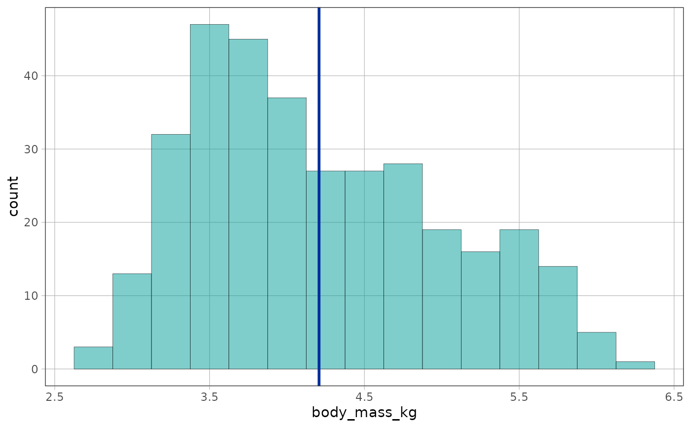
# the empty model, written as a formula
gf_histogram(~body_mass_kg, data = penguins, binwidth = 0.25) %>%
gf_model(body_mass_kg ~ NULL)
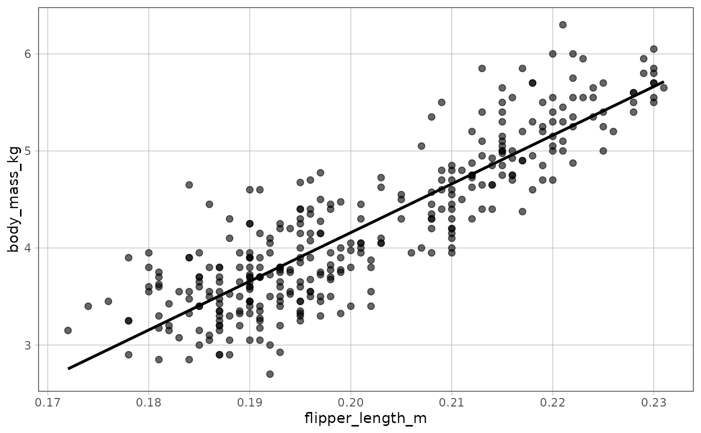
 # with no model, gf_model() draws the model the plot implies: a numeric
# predictor draws the regression line gf_lm() would fit
gf_point(body_mass_kg ~ flipper_length_m, data = penguins) %>%
gf_model()
# with no model, gf_model() draws the model the plot implies: a numeric
# predictor draws the regression line gf_lm() would fit
gf_point(body_mass_kg ~ flipper_length_m, data = penguins) %>%
gf_model()
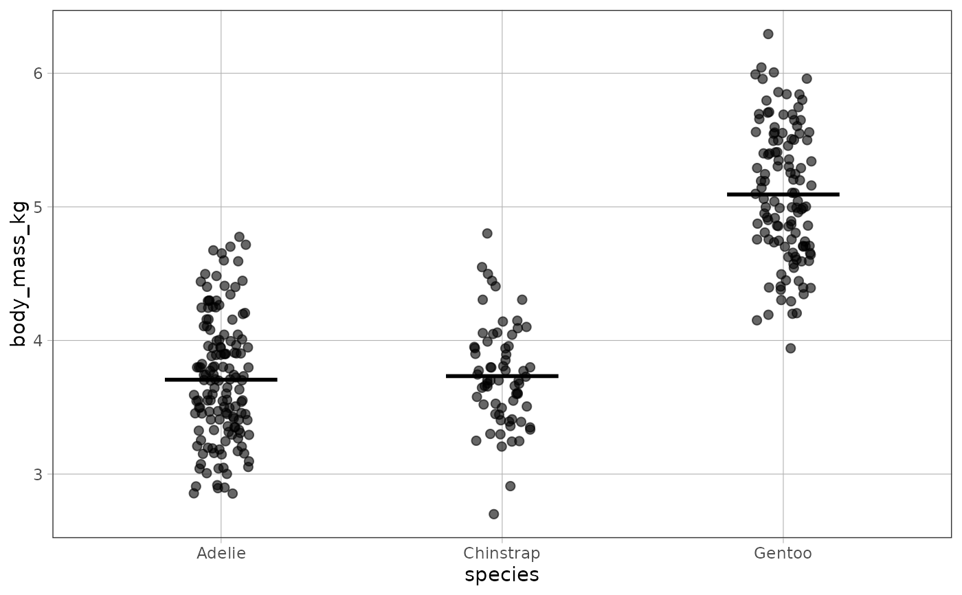
 # a categorical predictor draws one mark at each group's mean
gf_jitter(body_mass_kg ~ species, data = penguins, width = .1) %>%
gf_model()
# a categorical predictor draws one mark at each group's mean
gf_jitter(body_mass_kg ~ species, data = penguins, width = .1) %>%
gf_model()
 # a plot that draws only its outcome implies the grand mean
gf_histogram(~body_mass_kg, data = penguins, binwidth = 0.25) %>%
gf_model()
# a plot that draws only its outcome implies the grand mean
gf_histogram(~body_mass_kg, data = penguins, binwidth = 0.25) %>%
gf_model()