Frame a Sampling Distribution With Its Data Generating Process
Source:R/show_overlays.R
show_dgp.Rd![[Experimental]](figures/lifecycle-experimental.svg)
Details
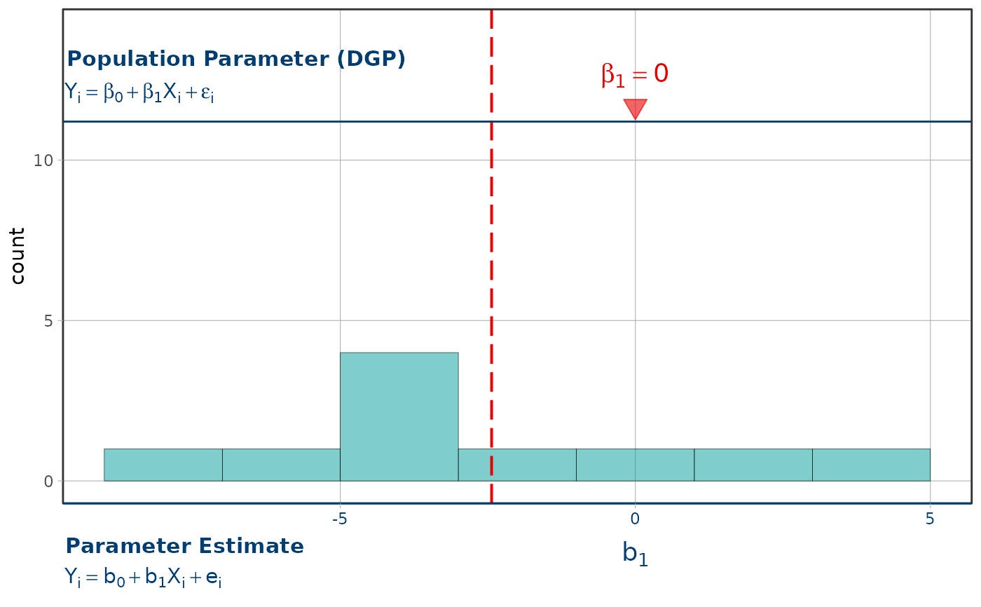
Frames a distribution of estimates with the process that generated them: the population model on a top axis labeled "Population Parameter (DGP)", the sample estimate below the plot, and a marker at the null hypothesis (\(\beta_1 = 0\)) on both – drawn only when zero is on the axis.
The population and estimate frames are position guides, outside the data
panel. They therefore do not change the count range and remain compatible
with fixed, zoomed, transformed, and free count axes. The ordinary numeric x
guide stays in place as the estimate scale. Zero is omitted when it is not a
finite visible value on that scale; it is never moved to a boundary.
An x position scale can be added before or after show_dgp(); the final scale
supplies the limits and breaks for both guides. A later ggplot2::guides()
call can replace either guide in the usual ggplot2 way.
The plot's x label is retained when a later guide replaces the estimate
frame. Existing plot theme settings, including inherited axis.text,
axis.title, and axis.line settings, take precedence over the frame's
default axis styling. Later themes follow ggplot2's usual inheritance:
change axis.text.x, axis.title.x, or axis.line.x/axis.line.y to
override the frame's axis-specific settings.
See also
The sampling distributions guide draws this figure inside a full shuffle-and-estimate workflow: https://coursekata.github.io/coursekata-r/articles/sampling-distributions.html
Examples
# with only ten shuffles the mean of the distribution can land well away
# from the null hypothesis marked on the top axis
set.seed(42)
shuffled <- data.frame(b1 = replicate(10, {
  b1(lm(base::sample(TipExperiment$Tip) ~ Condition, data = TipExperiment))
}))

# expand_limits() sets the count axis so two runs can be compared side by
# side; show_dgp() does not alter that range
gf_histogram(~b1, data = shuffled, binwidth = 2) %>%
  gf_refine(ggplot2::expand_limits(y = 10)) %>%
  show_mean() %>%
  show_dgp()