![[Experimental]](figures/lifecycle-experimental.svg)
Details
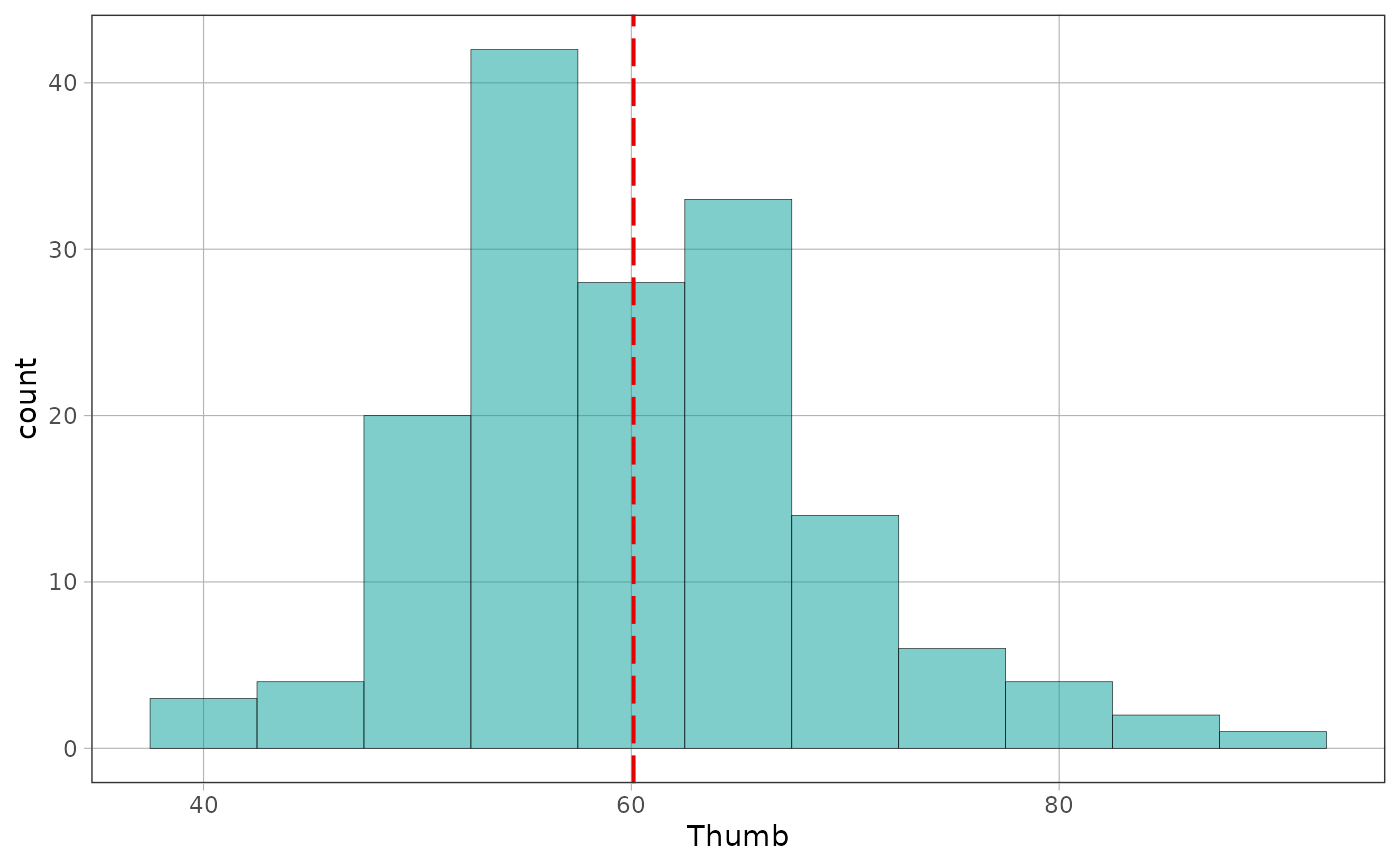
Draws a vertical line at the mean of the variable a distribution is built
from, spanning the count axis. Works on any plot of one distribution –
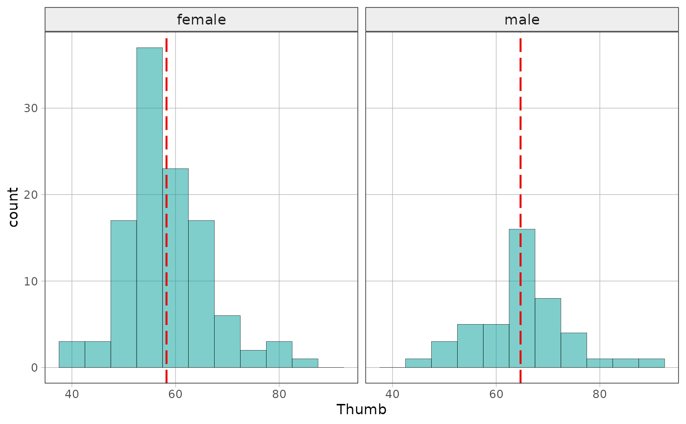
gf_histogram(), gf_dotplot(), gf_squareplot(). A faceted plot gets one
line per panel, at that panel's own mean, because a facet is a region with
its own subset of the data. Each line spans the count axis of the panel it
is drawn in, so scales = "free_y" is supported and no panel is stretched
to hold another panel's line.
A plot with a variable on each axis is refused. The middle of a
two-variable plot is a model, and gf_model() draws models – an hline at
the mean of the outcome for the empty model. Averaging the x variable of a
scatterplot would draw a line nobody asked for.
See also
show_dgp() frames a sampling distribution with the process that
generated it; gf_model() draws the mean of a two-variable plot's outcome.