![[Experimental]](figures/lifecycle-experimental.svg)
Usage
gf_squareplot(
  object = NULL,
  gformula = NULL,
  data = NULL,
  ...,
  binwidth = NULL,
  bins = NULL,
  center = NULL,
  boundary = NULL,
  closed = NULL,
  breaks = NULL,
  bars = "none",
  na.rm = TRUE,
  xlab,
  ylab,
  title,
  subtitle,
  caption,
  geom = coursekata::GeomSquareplot,
  stat = coursekata::StatSquareplot,
  position = "identity",
  show.legend = NA,
  show.help = NULL,
  inherit = TRUE,
  environment = parent.frame()
)
Arguments
- object
A ggplot object, a data frame, or a formula. When a plot, the squares are added to it.
- gformula
A formula with shape
~x, optionally faceted as~ x | z.- data
A data frame holding the variable in
gformula.- ...
Aesthetics such as
filloralpha, either set to a value or mapped with a one-sided formula (fill = ~group).colorsets the color of the separators between squares and may be mapped;bar_colorsets the bar's own color, andbar_linewidthits width. Also takesggplot2::stat_bin()'spad, which adds an empty bin on either end of the range.- binwidth
Width of the bins, for a continuous x. Chosen from the data when unset:
1for whole-number data spanning 50 or less, so every value gets a column of its own, and a thirtieth of the range otherwise. Has no effect on a discrete x, which is counted instead.- bins
How many bins to divide the range into, used when
binwidthis unset.- center, boundary
The center of one bin, or an edge of one. Either places the whole grid; give one or the other, not both.
- closed
Which end of a bin holds a value that lands exactly on it,
"right"or"left". For whole-number data,boundary = 0.5puts every value in the column it is labeled with, whichever end is closed.- breaks
The bin edges themselves, which need not be evenly spaced.
- bars
Display style:
"none"(squares only),"outline"(squares inside the bar they add up to) or"solid"(that bar alone).- na.rm
Must be
TRUE. A missing value has no square to draw.- xlab, ylab, title, subtitle, caption
Labels.
- geom, stat, position
The layer's geom, stat and position.
- show.legend
Whether to show a legend, or
NAto decide per aesthetic.- show.help
Print the function's own help instead of drawing.
- inherit
Whether to inherit the plot's aesthetics.
- environment
Where to evaluate the formula.
Details
Creates histograms where each observation is drawn as its own square, stacked
into columns, so a bin's height can be counted as well as read off the axis:
n = 47 is 47 squares. Designed for teaching statistical concepts like
sampling distributions and hypothesis testing.
Sensible defaults are chosen based on the data:
For integer-valued data with a small range, the
binwidthdefaults to 1 so that each integer gets its own column. Everything else about the bins isstat_bin()'s:bins,center,boundary,closed,breaksandpadput a squareplot's columns exactly where agf_histogram()'s bars would be.A factor keeps its levels, so a level nobody landed in still holds its place on the axis. Knowing a value never occurred is the point.
A discrete x – a factor, character or logical vector – is counted, one column per level, positioned the way
gf_bar()positions its bars. The binning arguments (bins,binwidth,center,boundary,closed,breaks,pad) belong to a continuous x; supplying one alongside a discrete x warns rather than changing the plot.The white separator between two squares is capped at a quarter of a square's smaller side, so as a bin fills and its squares shrink the separator thins with them and the squares stay countable.
The y axis is a count, so its breaks are whole numbers.
Counts must be finite, nonnegative whole numbers. Integer frequency weights are supported; fractional weighted counts need a histogram or bar plot instead.
Fill and separator colour inherit the plot's mappings. With no mapping or
fixed value, squares use teal fill and white separators. Set fill or
color explicitly to override an inherited mapping.
Plot-level after_scale() linewidth mappings use automatic border fitting.
Supply the mapping on the squareplot layer itself to keep its width fixed.
The bins are a histogram's bins: binwidth, bins, center, boundary,
closed and breaks mean what they mean on ggformula::gf_histogram(), and
the same arguments give the same bin edges and the same counts, so squares
laid over bars land inside them.
Everything that is not the squares is a layer or a scale: %>% show_mean(),
%>% show_dgp(), %>% gf_lims(x = ),
%>% gf_refine(ggplot2::expand_limits(y = )). Each of these was an argument
here once, and passing the old name is refused with the replacement named, so
a call written against the old signature says what to write rather than
drawing a plot with the mark missing.
See also
show_mean() and show_dgp() annotate a distribution.
The sampling distributions guide shows this plot in the context of a full
shuffle-and-estimate workflow:
https://coursekata.github.io/coursekata-r/articles/sampling-distributions.html
Examples
# each observation is a countable square
gf_squareplot(~Thumb, data = Fingers)
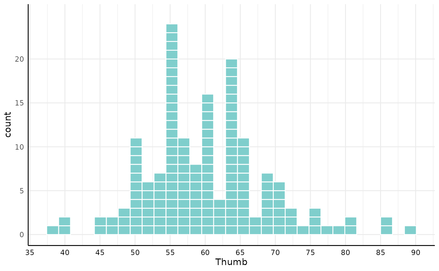 # `bars` controls the display: "none" (default), "outline", or "solid"
gf_squareplot(~Thumb, data = Fingers, bars = "outline")
# `bars` controls the display: "none" (default), "outline", or "solid"
gf_squareplot(~Thumb, data = Fingers, bars = "outline")
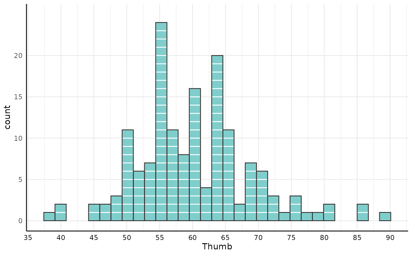 # the bins are a histogram's bins, so squares laid over bars land inside them --
# name the grid on both layers, because a layer never reads its neighbor's
gf_histogram(~Thumb, data = Fingers, bins = 8) %>% gf_squareplot(bins = 8)
# the bins are a histogram's bins, so squares laid over bars land inside them --
# name the grid on both layers, because a layer never reads its neighbor's
gf_histogram(~Thumb, data = Fingers, bins = 8) %>% gf_squareplot(bins = 8)
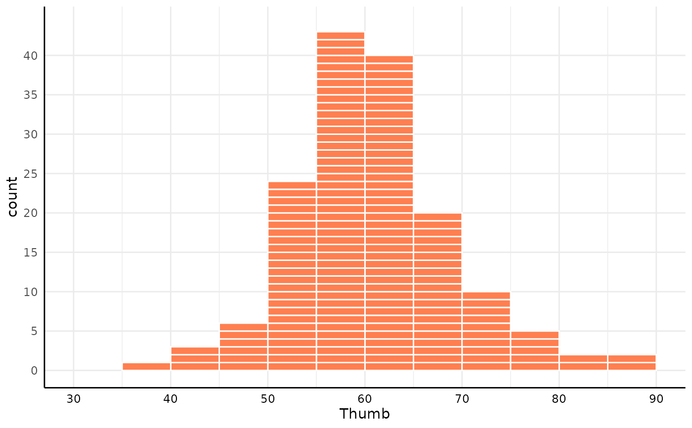 # customize fill color, binwidth, and axis limits
gf_squareplot(~Thumb, data = Fingers, fill = "coral", binwidth = 5) %>%
gf_lims(x = c(30, 90))
# customize fill color, binwidth, and axis limits
gf_squareplot(~Thumb, data = Fingers, fill = "coral", binwidth = 5) %>%
gf_lims(x = c(30, 90))
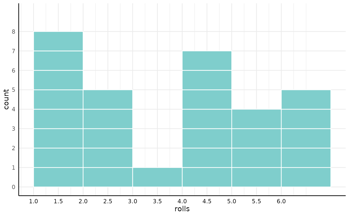 # integer data with a small range gets one column per integer
int_data <- data.frame(rolls = sample(1:6, 30, replace = TRUE))
gf_squareplot(~rolls, data = int_data)
# integer data with a small range gets one column per integer
int_data <- data.frame(rolls = sample(1:6, 30, replace = TRUE))
gf_squareplot(~rolls, data = int_data)
 # the plot is a real ggformula layer, so it facets and takes mapped aesthetics
gf_squareplot(~ Thumb | Sex, data = Fingers)
# the plot is a real ggformula layer, so it facets and takes mapped aesthetics
gf_squareplot(~ Thumb | Sex, data = Fingers)
 gf_squareplot(~Thumb, data = Fingers, fill = ~Sex)
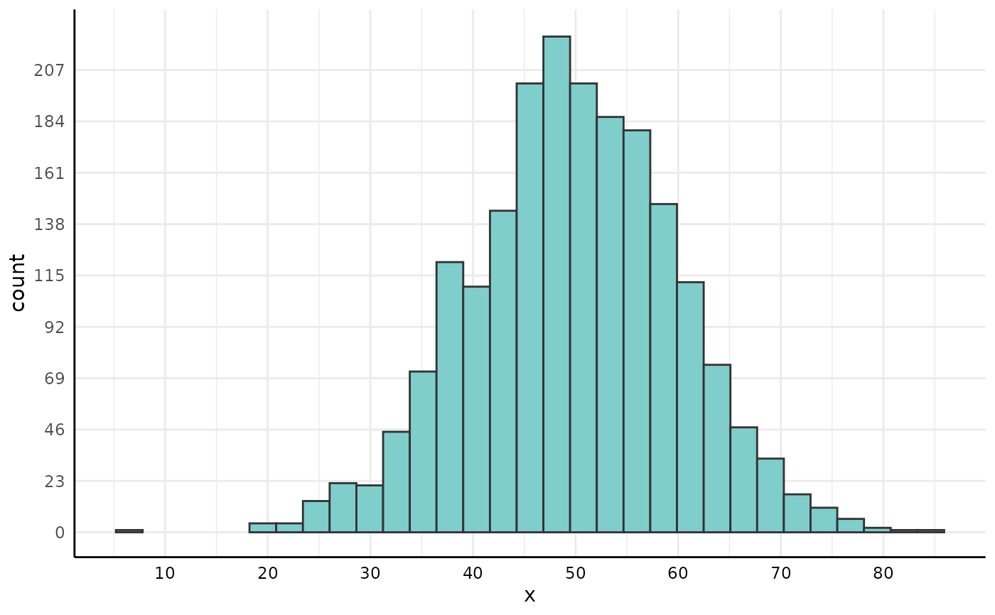
 # with 2000 observations the squares shrink, and their separators thin to fit
set.seed(24)
large_data <- data.frame(x = rnorm(2000, mean = 50, sd = 10))
gf_squareplot(~x, data = large_data)
# with 2000 observations the squares shrink, and their separators thin to fit
set.seed(24)
large_data <- data.frame(x = rnorm(2000, mean = 50, sd = 10))
gf_squareplot(~x, data = large_data)
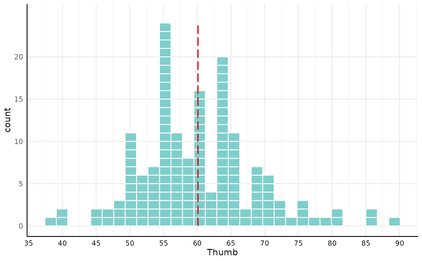
 # show a dashed line at the sample mean
gf_squareplot(~Thumb, data = Fingers) %>% show_mean()
# show a dashed line at the sample mean
gf_squareplot(~Thumb, data = Fingers) %>% show_mean()
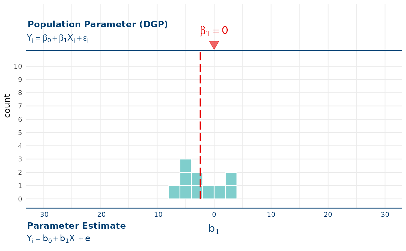
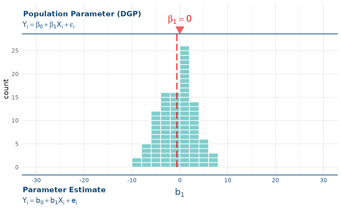
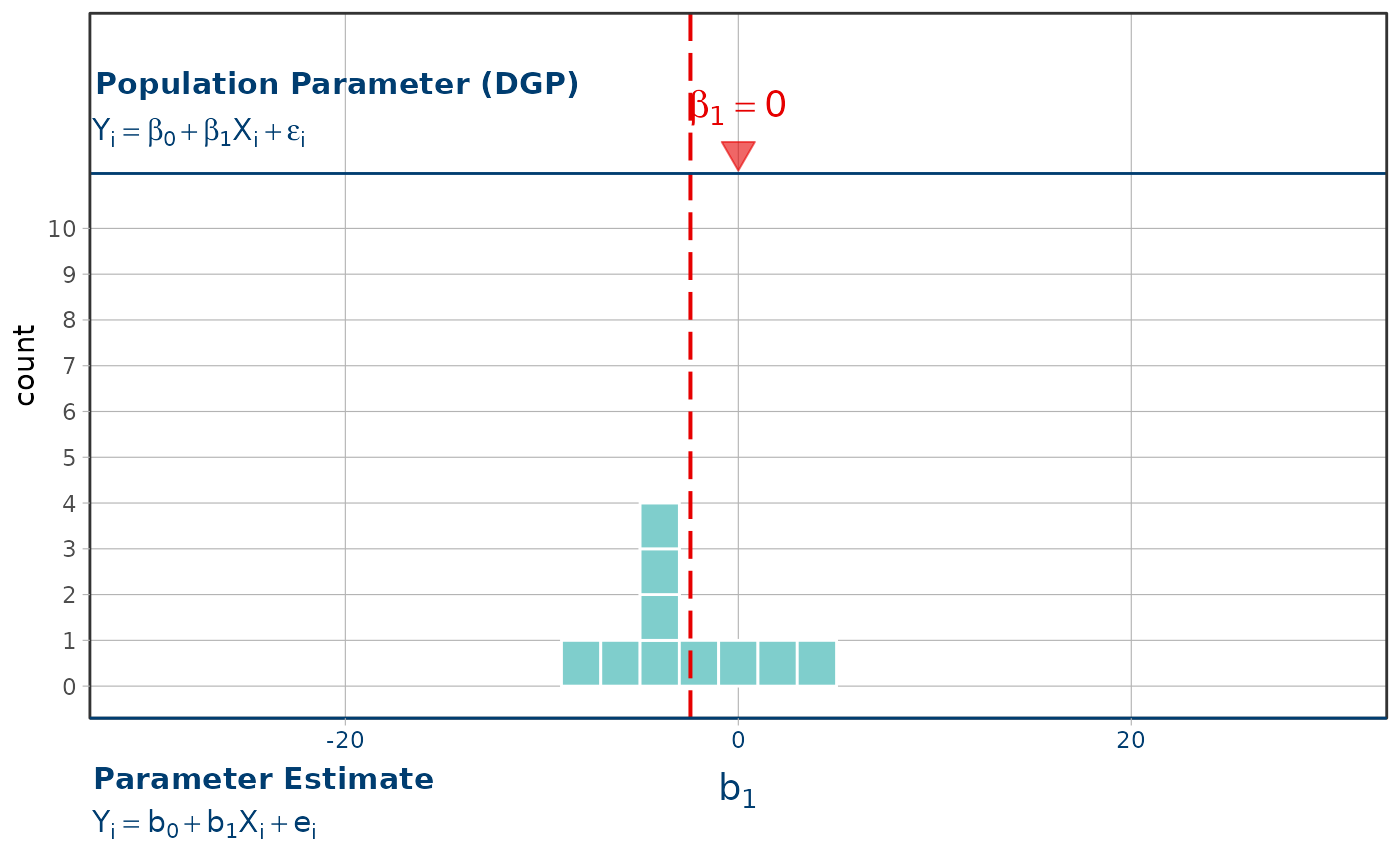
 # frame a sampling distribution with its data generating process: with only
# 10 shuffles, the mean of the distribution can land far from the null.
# Position-scale limits and show_dgp() compose in either order; neither
# changes the count range.
shuffled_b1 <- function(n) {
data.frame(b1 = replicate(n, {
shuffled_tip <- base::sample(TipExperiment$Tip)
b1(lm(shuffled_tip ~ Condition, data = TipExperiment))
}))
}
set.seed(42)
gf_squareplot(~b1, data = shuffled_b1(10), binwidth = 2) %>%
gf_lims(x = c(-30, 30)) %>%
gf_refine(ggplot2::expand_limits(y = 10)) %>%
show_mean() %>%
show_dgp()
# frame a sampling distribution with its data generating process: with only
# 10 shuffles, the mean of the distribution can land far from the null.
# Position-scale limits and show_dgp() compose in either order; neither
# changes the count range.
shuffled_b1 <- function(n) {
data.frame(b1 = replicate(n, {
shuffled_tip <- base::sample(TipExperiment$Tip)
b1(lm(shuffled_tip ~ Condition, data = TipExperiment))
}))
}
set.seed(42)
gf_squareplot(~b1, data = shuffled_b1(10), binwidth = 2) %>%
gf_lims(x = c(-30, 30)) %>%
gf_refine(ggplot2::expand_limits(y = 10)) %>%
show_mean() %>%
show_dgp()
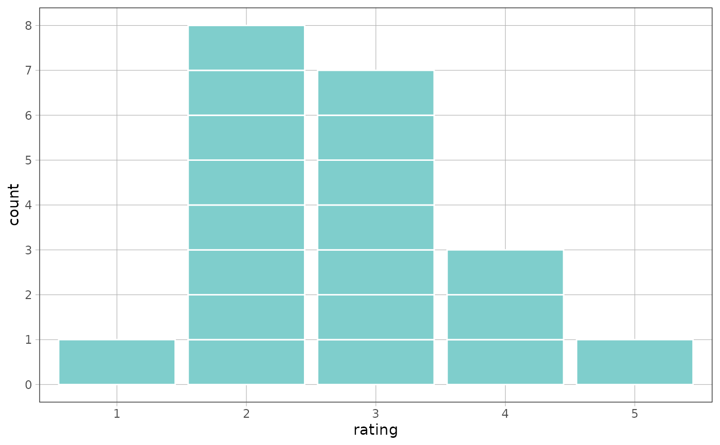
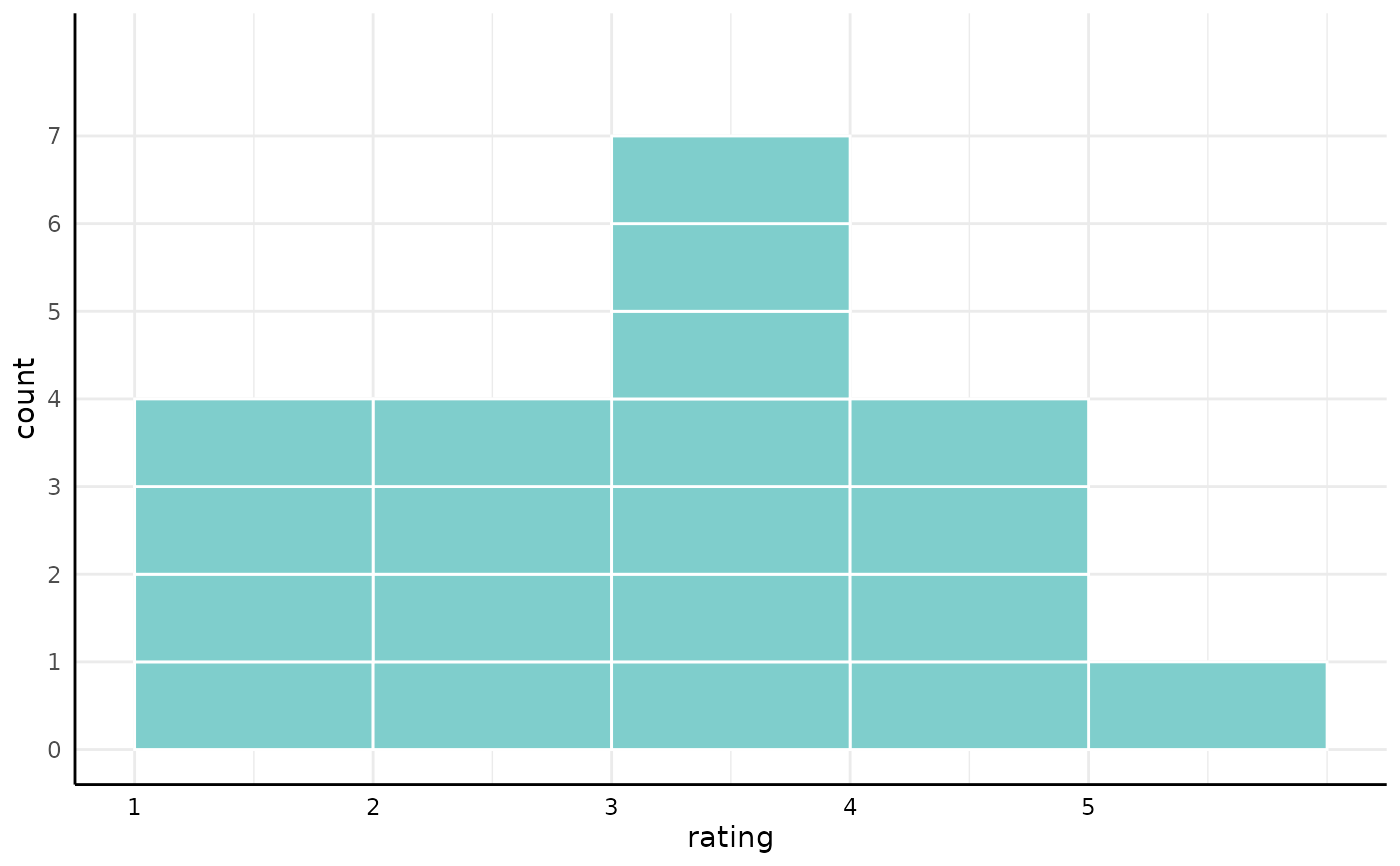
 # a factor keeps every level, including the ones nothing landed in
ratings <- data.frame(rating = factor(
base::sample(1:5, 20, replace = TRUE, prob = c(1, 2, 4, 2, 1)),
levels = 1:5
))
gf_squareplot(~rating, data = ratings)
# a factor keeps every level, including the ones nothing landed in
ratings <- data.frame(rating = factor(
base::sample(1:5, 20, replace = TRUE, prob = c(1, 2, 4, 2, 1)),
levels = 1:5
))
gf_squareplot(~rating, data = ratings)