Sampling distributions
Source:vignettes/articles/sampling-distributions.Rmd
sampling-distributions.RmdA sampling distribution answers a question about what else could
have happened. If the empty model were true — if condition made no
difference to tips at all — how big a b1 would we see just
from the luck of which tables happened to land in which group?
do() answers that by running the same estimate many
times over data that has been shuffled, so any relationship between the
two variables is broken by construction.
set.seed(42)
sdob1 <- do(1000) * b1(shuffle(Tip) ~ Condition, data = TipExperiment)
head(sdob1)
#>           b1
#> 1 -5.0454545
#> 2 -4.0454545
#> 3 -7.9545455
#> 4 -3.5000000
#> 5 -1.7727273
#> 6  0.2272727
Each row is one b1 from one shuffle. Plotted, they are
the range of estimates the empty model produces.
gf_histogram(~b1, data = sdob1, binwidth = 1)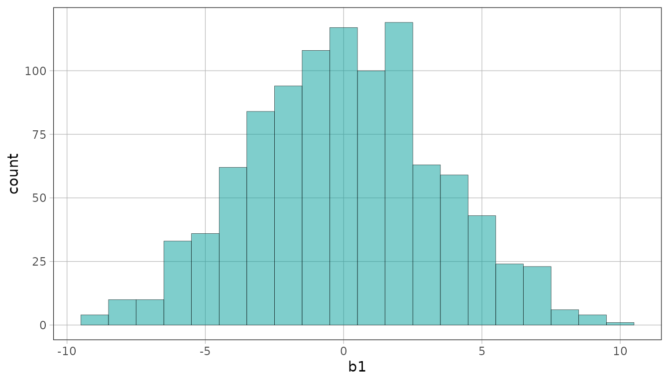
Marking off regions
The distribution part functions turn a region of that distribution
into a fill aesthetic. middle() marks the values we would
expect to see often.
gf_histogram(~b1, data = sdob1, fill = ~ middle(b1, .95), binwidth = 1)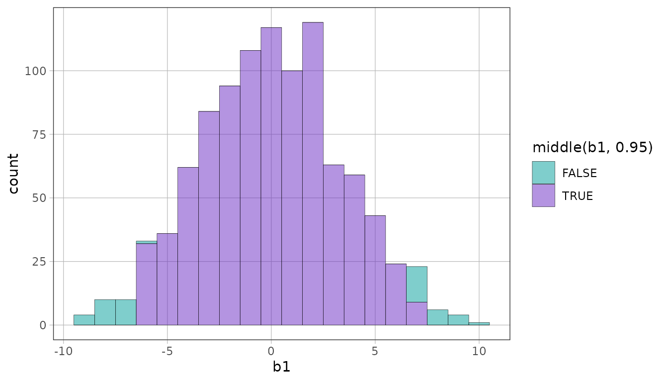
tails() marks the same cutoffs with the opposite
coloring: the 5% most extreme values, the ones that would be surprising
under the empty model.
gf_histogram(~b1, data = sdob1, fill = ~ tails(b1, .95), binwidth = 1)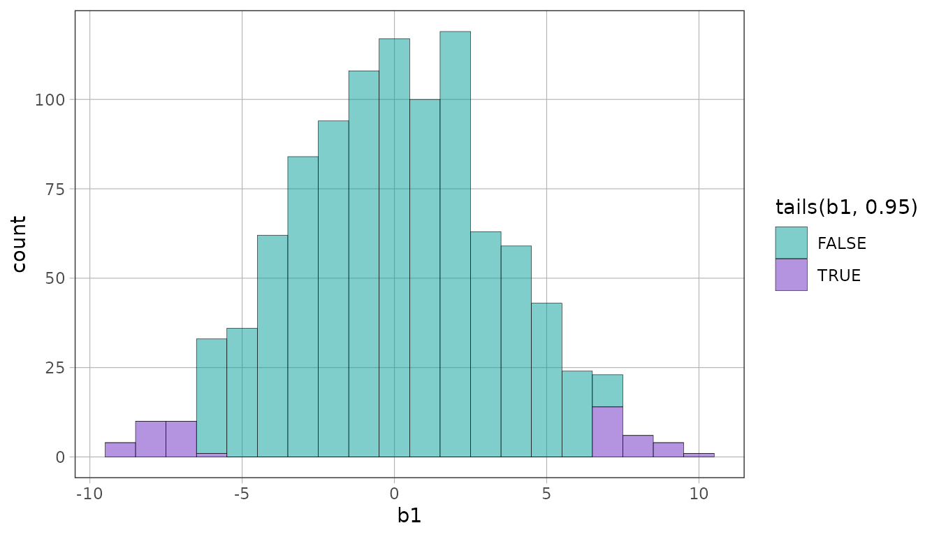
outer() marks the same region but takes the tail
proportion directly, which reads more naturally when you are thinking in
terms of how much is out rather than how much is
in.
gf_histogram(~b1, data = sdob1, fill = ~ outer(b1, .05), binwidth = 1)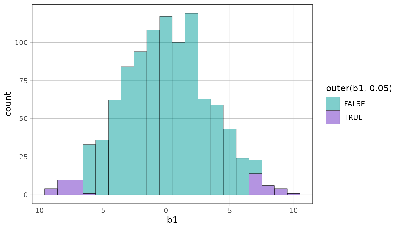
For a directional hypothesis, all of the 5% goes in one tail.
gf_histogram(~b1, data = sdob1, fill = ~ upper(b1, .05), binwidth = 1)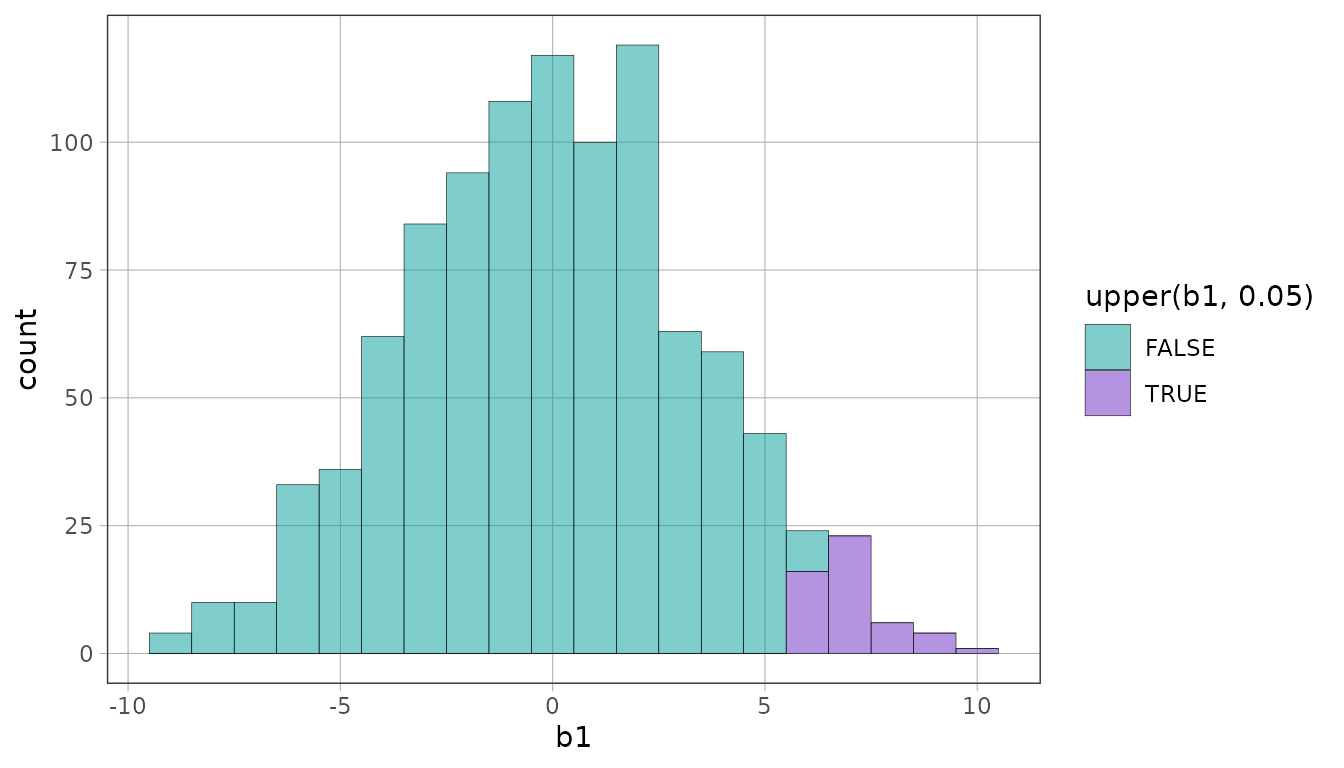
gf_histogram(~b1, data = sdob1, fill = ~ lower(b1, .05), binwidth = 1)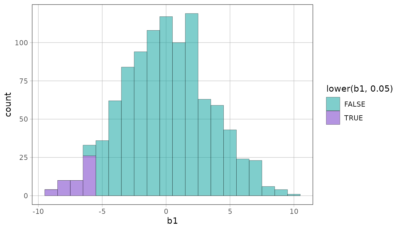
Marking the cutoffs themselves
Filling a region colors it. show_cutoffs() marks where
it ends, and it takes the region directly, so a plain histogram can have
cutoffs without being colored.
gf_histogram(~b1, data = sdob1, binwidth = 1) %>%
  show_cutoffs(middle(b1, .95))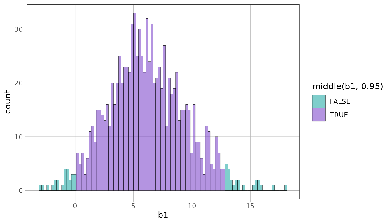
Because the region is named rather than read off the fill, the marked region and the colored one can differ: color the middle 95%, mark where the middle 99% ends.
gf_histogram(~b1, data = sdob1, fill = ~ middle(b1, .95), binwidth = 1) %>%
  show_cutoffs(middle(b1, .99))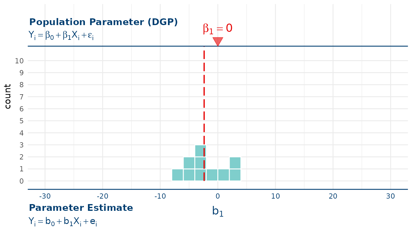
Two calls put two sets on one plot, which is how you see what
changing alpha costs you. show_labels = TRUE puts each
call’s explanation in its own measured callout inside the panel. The
callouts are placed together so their boxes and leaders stay separate
when the panel has room.
gf_histogram(~b1, data = sdob1, binwidth = 1) %>%
  show_cutoffs(middle(b1, .95), show_labels = TRUE) %>%
  show_cutoffs(middle(b1, .99), color = "firebrick", show_labels = TRUE)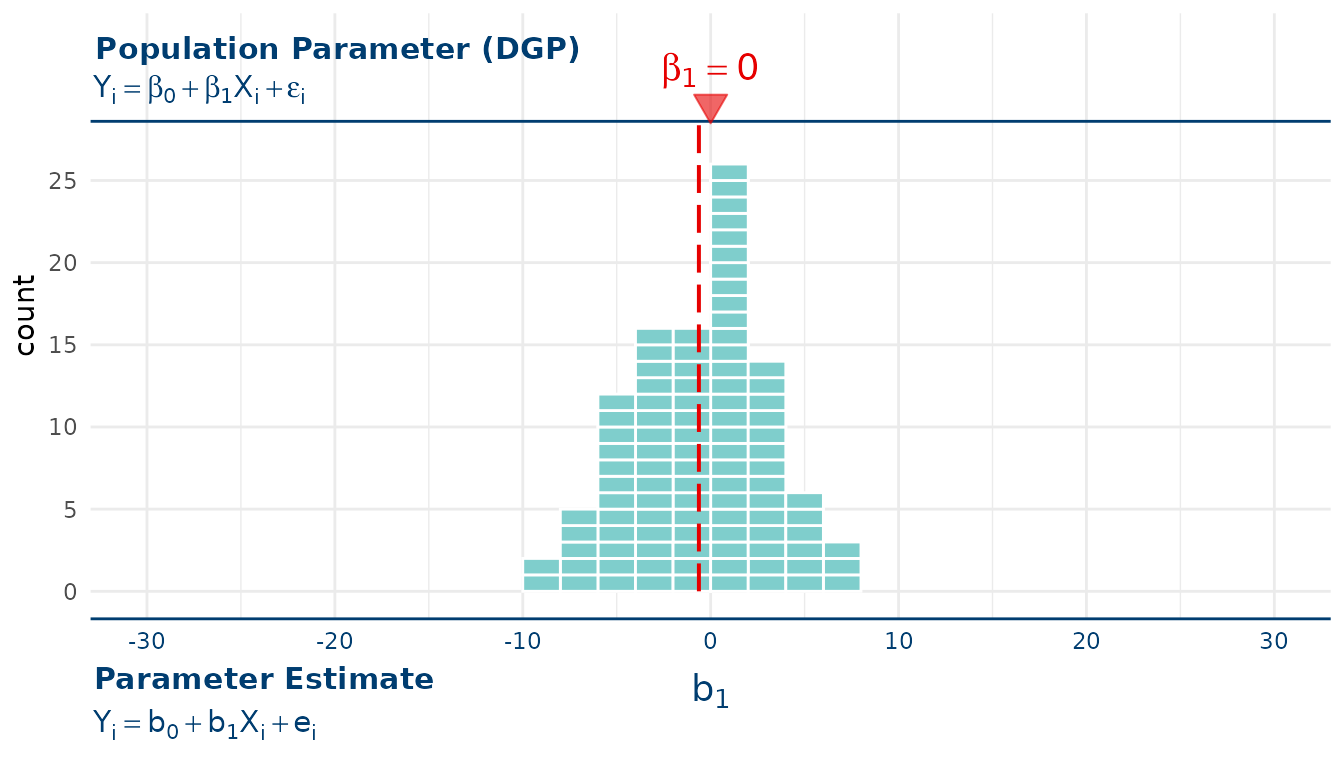
The wider pair is harder to fall outside, so a result that clears it
is rarer. For plots assembled at the ggplot2 layer level, the same
calculation and drawing pieces are available separately through
stat_cutoff(), geom_cutoff(), and
guide_cutoff().
Facets expose one deliberate difference between the two cutoff
interfaces. stat_cutoff() computes from each panel’s rows,
as a ggplot2 stat normally does. show_cutoffs() computes
once from the whole distribution and repeats those marks across panels.
Means have no such split: show_mean() and
stat_dist_mean() both compute a mean for each panel.
Bootstrapping instead of shuffling
Swap shuffle() for resample() and the same
pattern produces a bootstrap confidence interval rather than a null
distribution. Nothing is shuffled, so the relationship stays intact;
what varies is which observations are drawn.
set.seed(42)
sdob1_boot <- do(1000) * b1(Tip ~ Condition, data = resample(TipExperiment))
gf_histogram(~b1, data = sdob1_boot, fill = ~ middle(b1, .95), bins = 100)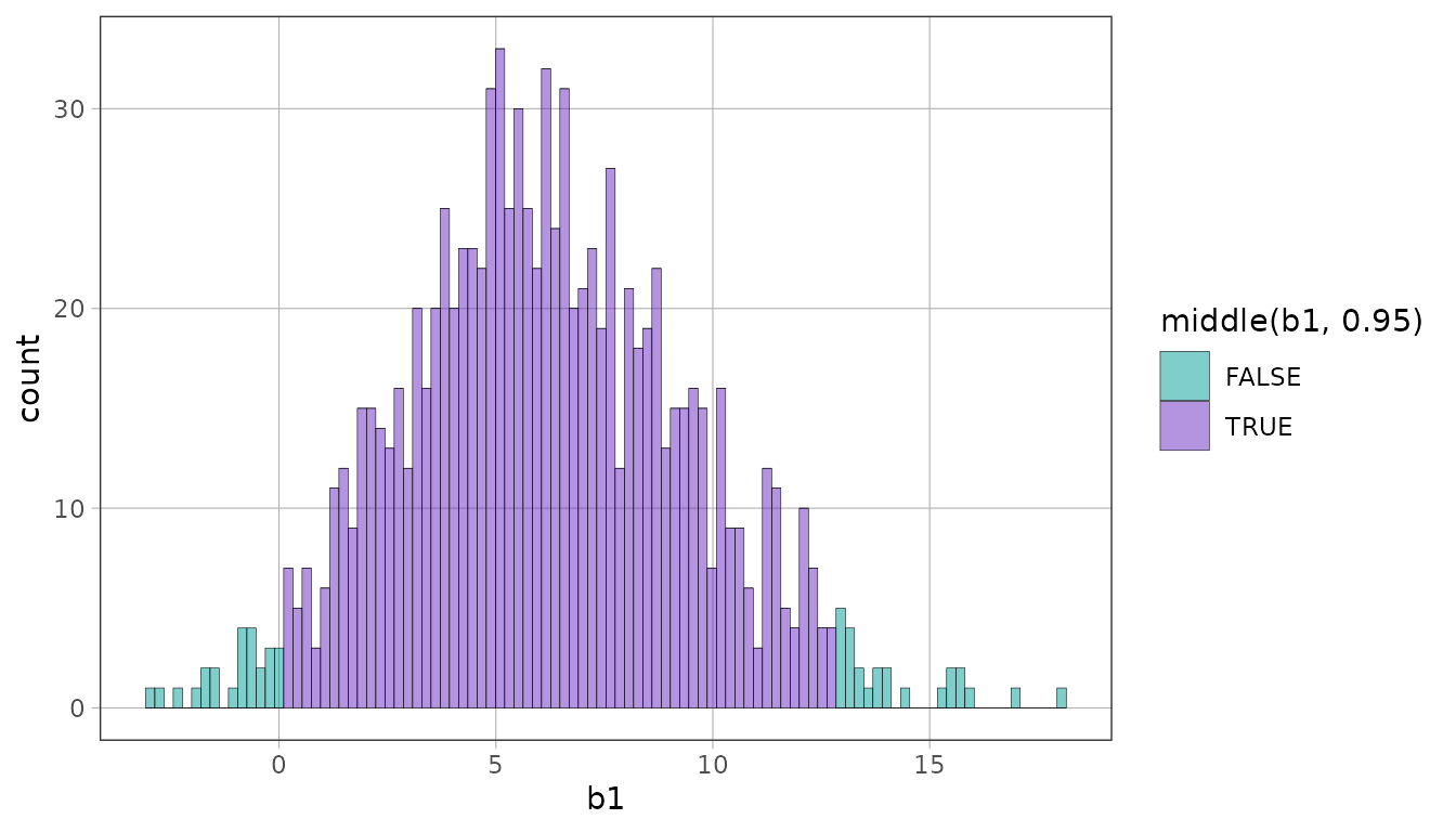
Framing the distribution with its DGP
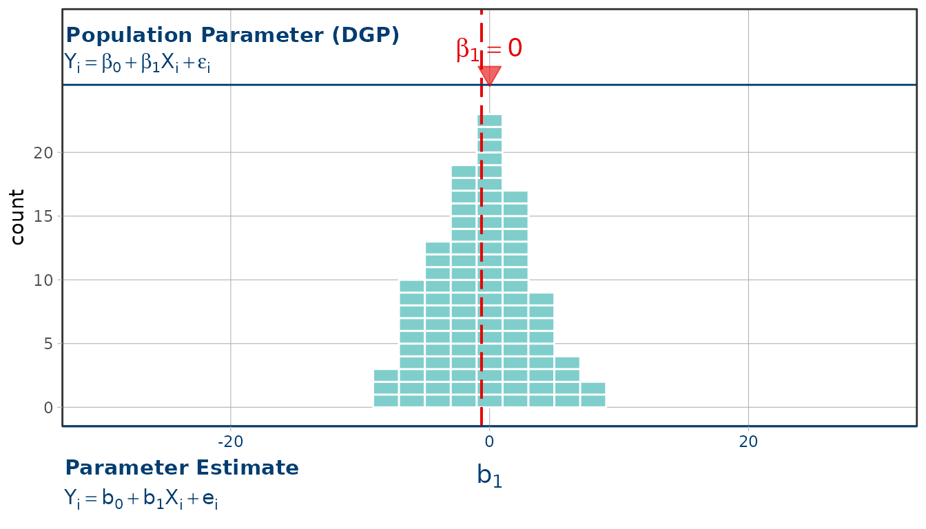
gf_squareplot() draws the same distribution as countable
squares, and show_dgp() frames it with the data generating
process: the population model on the top axis, the sample estimate on
the bottom, and a marker at the null hypothesis. Both overlays take a
plot and give one back, so the same frame goes just as readily on a
gf_histogram() of the same shuffles. The frame is measured
guide content outside the data panel, so it does not change the count
range or the size of the squares. An x position scale can come before or
after show_dgp(); the final scale supplies the guides’
limits and breaks.
With only ten shuffles the mean of the distribution can land well away from the null.
set.seed(42)
small <- do(10) * b1(shuffle(Tip) ~ Condition, data = TipExperiment)
gf_squareplot(~b1, data = small, binwidth = 2) %>%
  gf_lims(x = c(-30, 30)) %>%
  gf_refine(expand_limits(y = 10)) %>%
  show_mean() %>%
  show_dgp()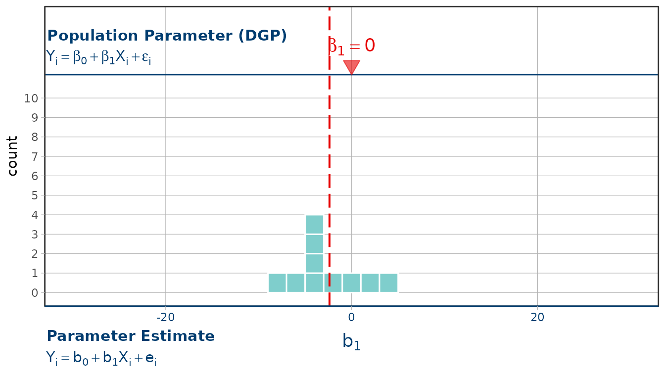
With a hundred it settles close to the null, which is what the empty
model predicts. expand_limits(y = ) sets a floor under the
count axis, so a distribution with a low peak still gets a full-height
panel; a hundred shuffles stack higher than ten and the axis grows to
fit them.
set.seed(42)
larger <- do(100) * b1(shuffle(Tip) ~ Condition, data = TipExperiment)
gf_squareplot(~b1, data = larger, binwidth = 2) %>%
  gf_lims(x = c(-30, 30)) %>%
  gf_refine(expand_limits(y = 10)) %>%
  show_mean() %>%
  show_dgp()