A model is a claim about what value to predict.
gf_model() draws that claim on top of the data it was fit
to, so the claim and the evidence are in the same picture.
The empty model
The empty model predicts the same value, the mean, for every observation. On a histogram it is a single vertical line.
empty_model <- lm(body_mass_kg ~ NULL, data = penguins)
gf_histogram(~body_mass_kg, data = penguins, binwidth = 0.25) %>%
  gf_model(empty_model)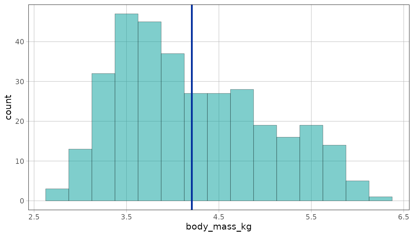
A plot already implies a model, so you can leave the argument out and
let gf_model() work out which one. A distribution on its
own implies the empty model.
gf_histogram(~body_mass_kg, data = penguins, binwidth = 0.25) %>%
  gf_model()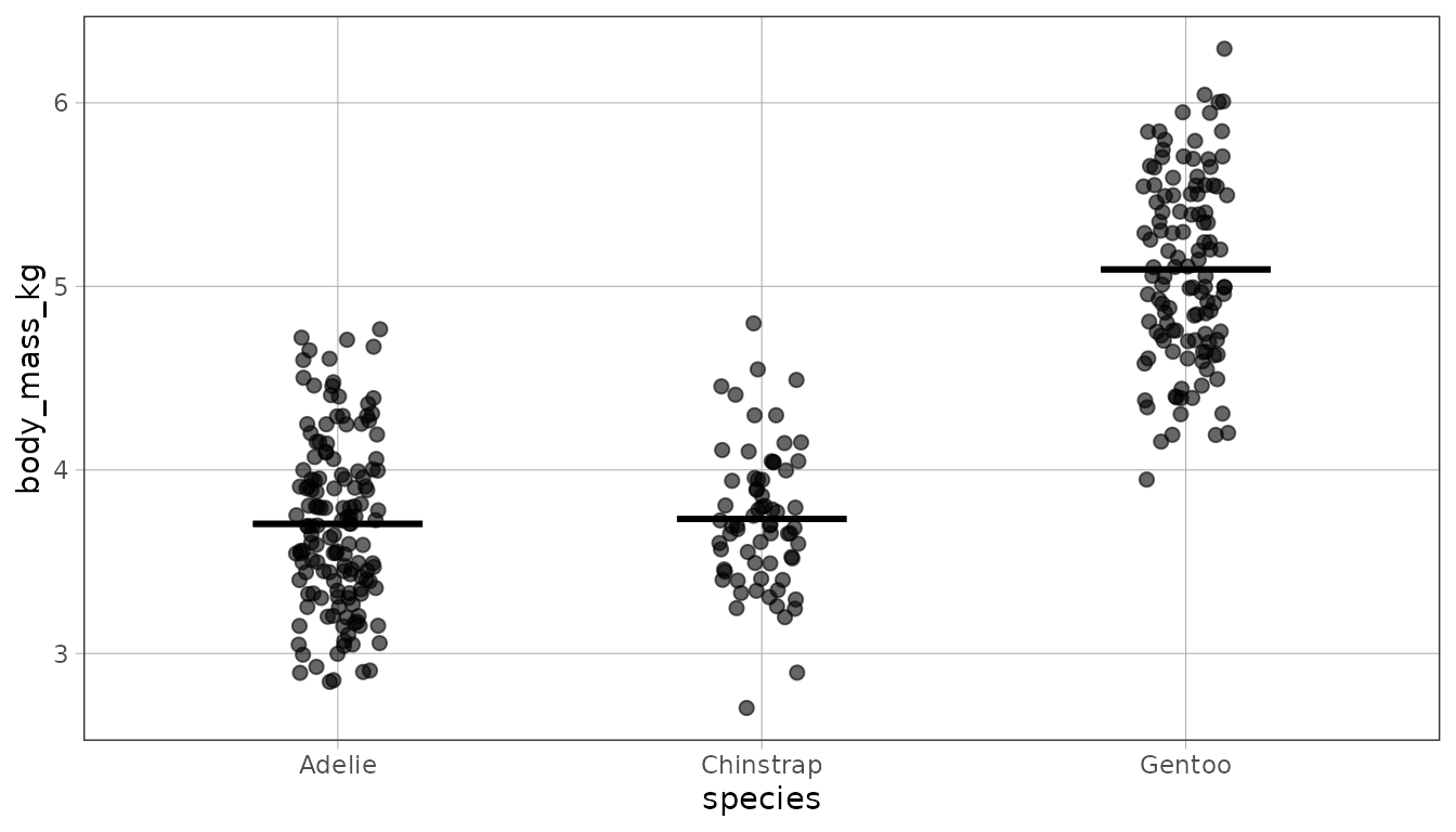
Group models
With a categorical explanatory variable the model predicts one value
per group, and gf_model() draws a mark at each group
mean.
species_model <- lm(body_mass_kg ~ species, data = penguins)
gf_jitter(body_mass_kg ~ species, data = penguins, width = .1) %>%
  gf_model(species_model)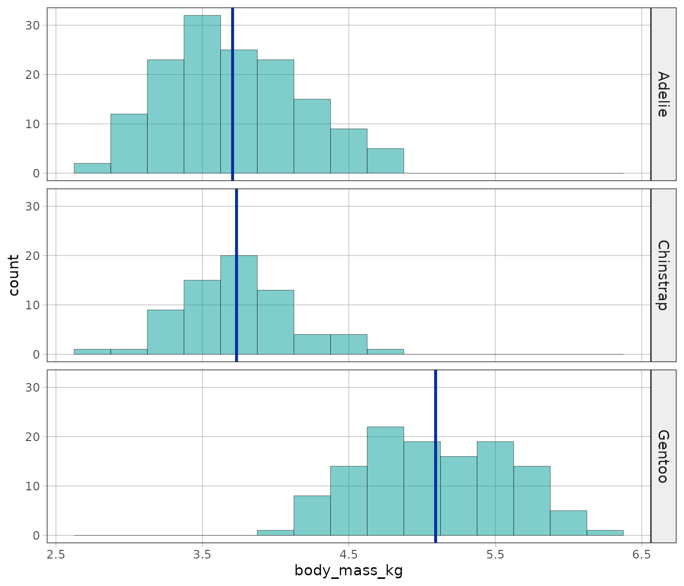
The same model layers onto faceted histograms, which makes the comparison between groups a comparison between panels.
gf_histogram(~body_mass_kg, data = penguins, binwidth = 0.25) %>%
  gf_facet_grid(species ~ .) %>%
  gf_model(species_model)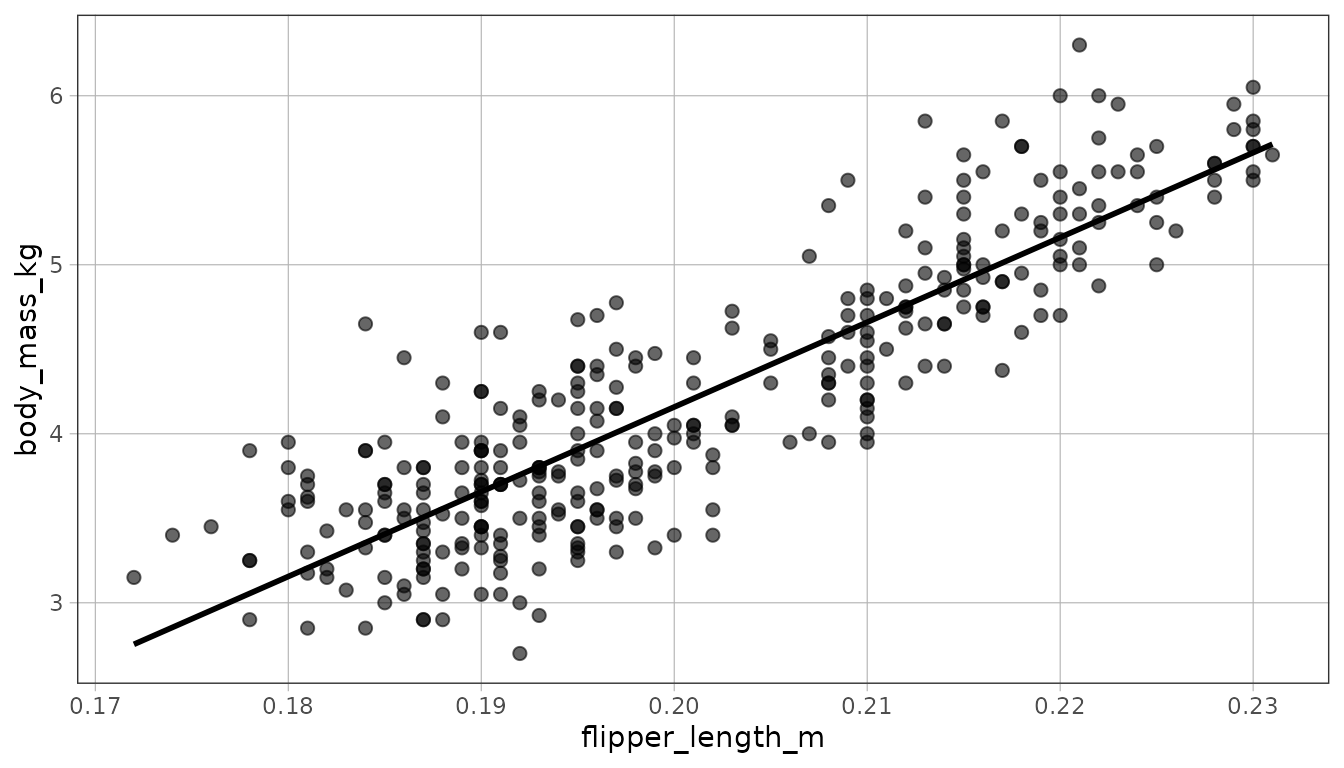
Regression models
With a quantitative explanatory variable the prediction is a line.
flipper_model <- lm(body_mass_kg ~ flipper_length_m, data = penguins)
gf_point(body_mass_kg ~ flipper_length_m, data = penguins) %>%
  gf_model(flipper_model)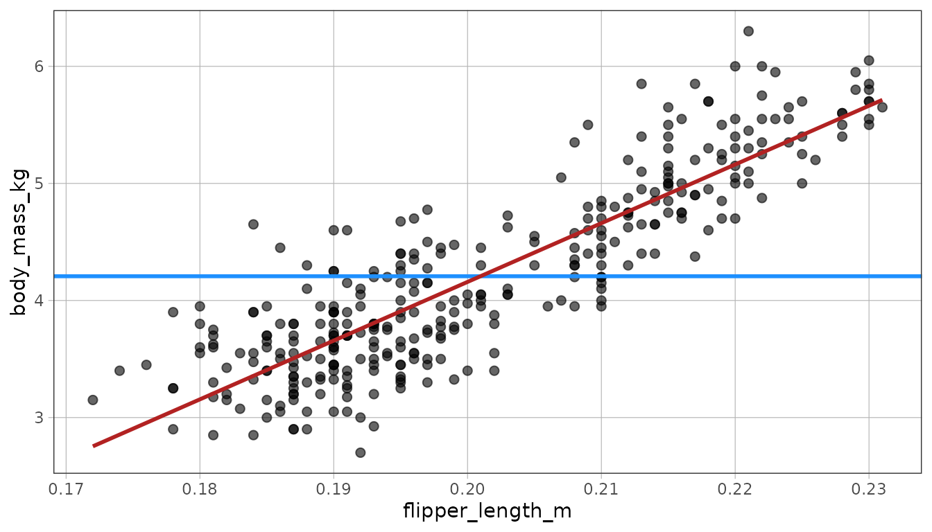
Layering two models in different colors puts the comparison on one plot: the empty model ignores flipper length, the regression model uses it.
gf_point(body_mass_kg ~ flipper_length_m, data = penguins) %>%
  gf_model(empty_model, color = "dodgerblue") %>%
  gf_model(flipper_model, color = "firebrick")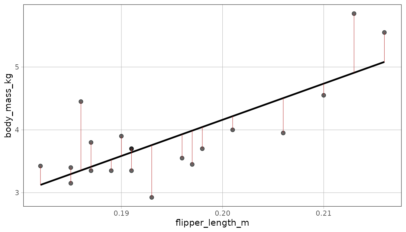
The ggplot2 front door
geom_model() draws the same model layer on an ordinary
ggplot2 plot. Supply a fitted model or a two-sided formula.
ggplot(penguins, aes(flipper_length_m, body_mass_kg)) +
  geom_point() +
  geom_model(model = flipper_model)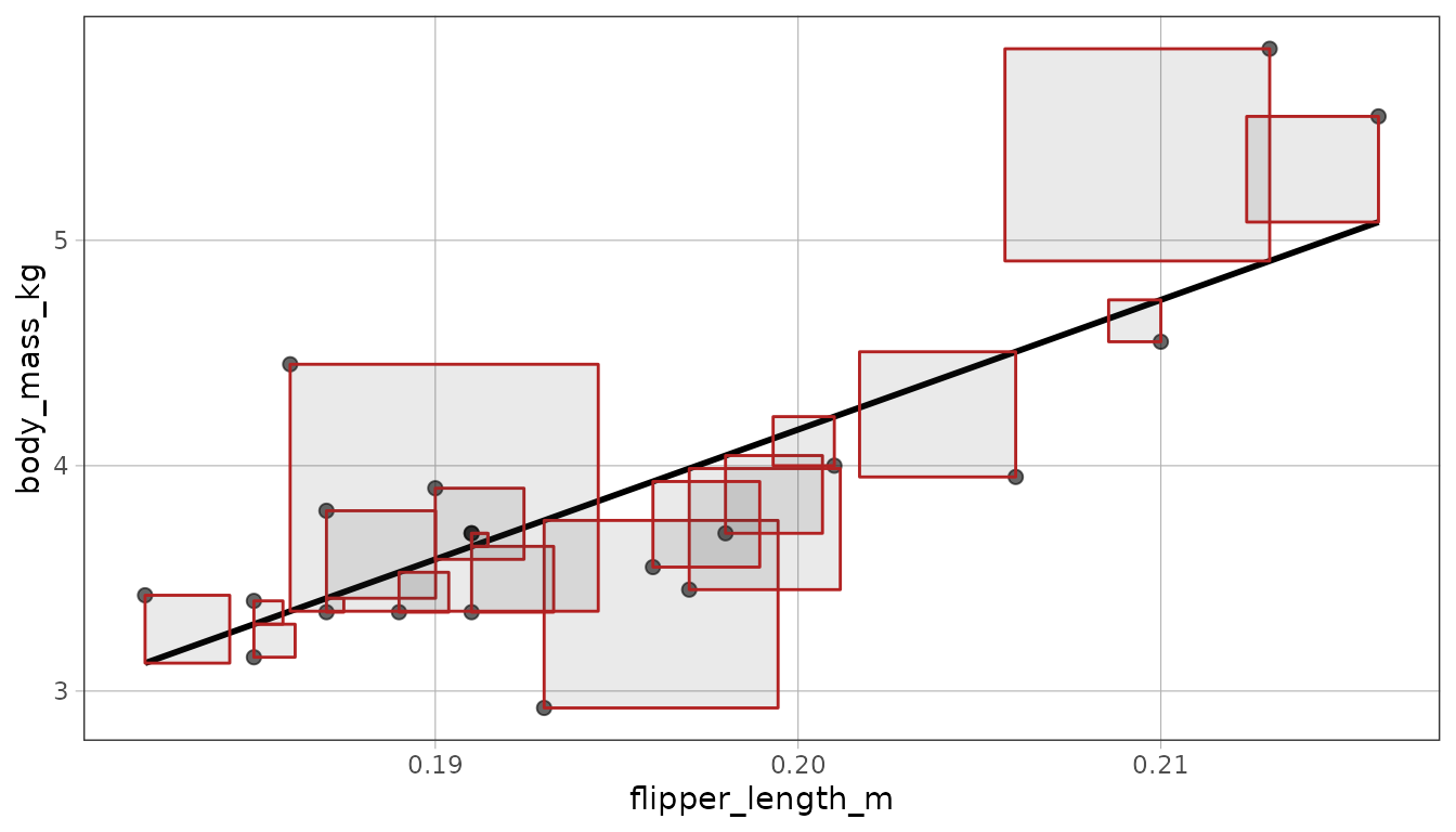
Leave model out to fit the model represented by the
layer’s mappings. As with other ggplot2 stats, this is computed
separately in each panel and group.
ggplot(penguins, aes(species, body_mass_kg)) +
  geom_jitter(width = .1) +
  geom_model()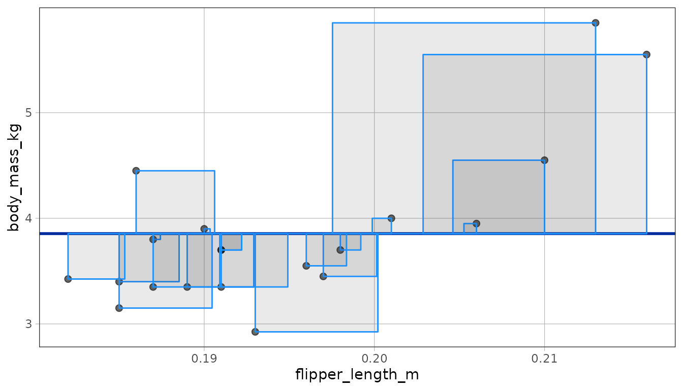
stat_model() exposes the same calculation when you want
to choose the drawing geom separately. gf_model() provides
the same model behavior with ggformula syntax.
Residuals
A residual is the observed value minus the model’s prediction.
gf_resid() draws a segment between those two values. With
hundreds of points the segments are hard to read, so take a small sample
first.
set.seed(1)
penguins_20 <- sample(penguins, 20)
sample_model <- lm(body_mass_kg ~ flipper_length_m, data = penguins_20)

gf_point(body_mass_kg ~ flipper_length_m, data = penguins_20) %>%
  gf_model(sample_model) %>%
  gf_resid(sample_model, color = "firebrick")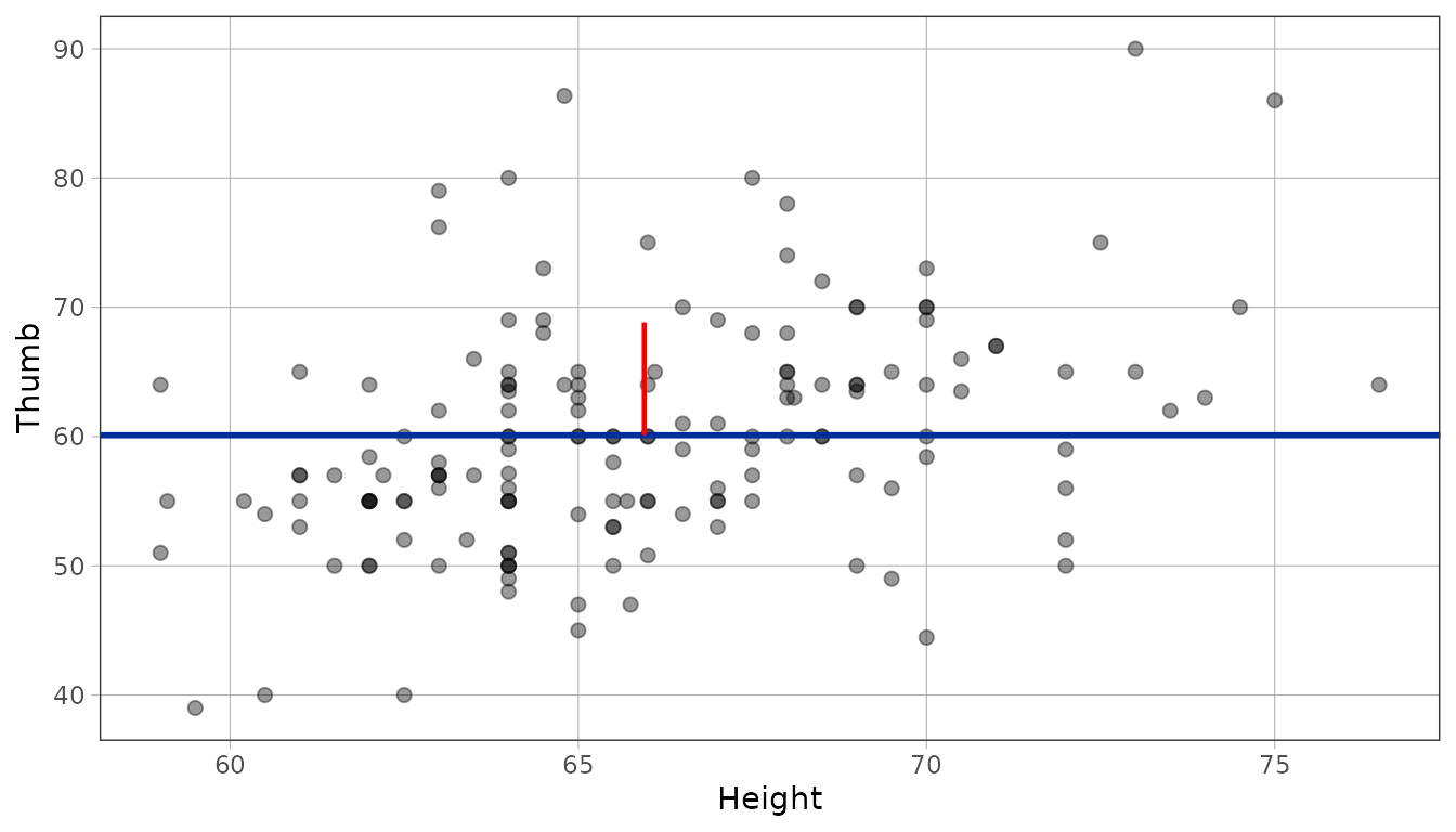
The ggplot2 layer uses the same implementation. Give it the fitted model; the plot still supplies the observations and their mappings.
ggplot(penguins_20, aes(flipper_length_m, body_mass_kg)) +
  geom_point() +
  geom_resid(model = sample_model, color = "firebrick")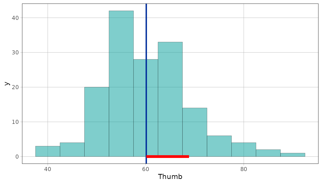
For jittered points, use one seeded position for the points and residuals. The points move; the fitted ends of the residuals stay on the model.
jitter <- position_jitter(width = .1, seed = 42)
gentoo_model <- lm(body_mass_kg ~ gentoo, data = penguins_20)

ggplot(penguins_20, aes(gentoo, body_mass_kg)) +
  geom_point(position = jitter) +
  geom_resid(model = gentoo_model, position = jitter, color = "firebrick")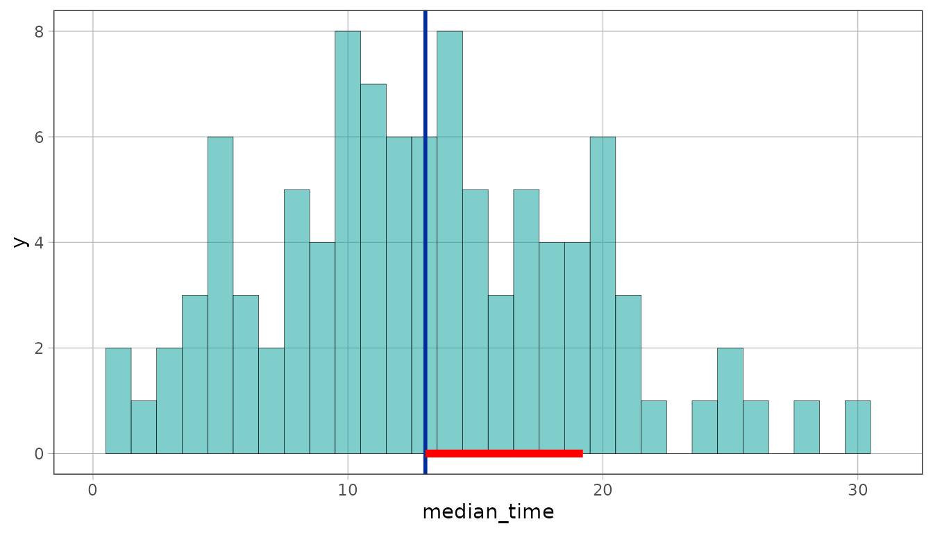
gf_square_resid() draws each residual as a square
instead of a segment, which makes squared error visible as
area: the quantity least squares is actually minimizing.
gf_point(body_mass_kg ~ flipper_length_m, data = penguins_20) %>%
  gf_model(sample_model) %>%
  gf_square_resid(sample_model, color = "firebrick")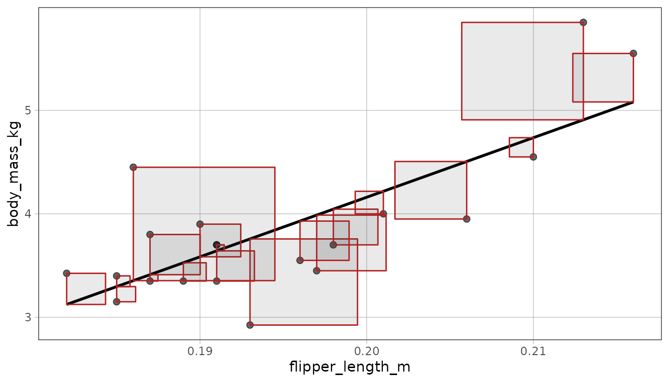
Comparing the empty model’s squares to the regression model’s is the clearest picture of what the predictor bought you.
empty_20 <- lm(body_mass_kg ~ NULL, data = penguins_20)
gf_point(body_mass_kg ~ flipper_length_m, data = penguins_20) %>%
  gf_model(empty_20) %>%
  gf_square_resid(empty_20, color = "dodgerblue")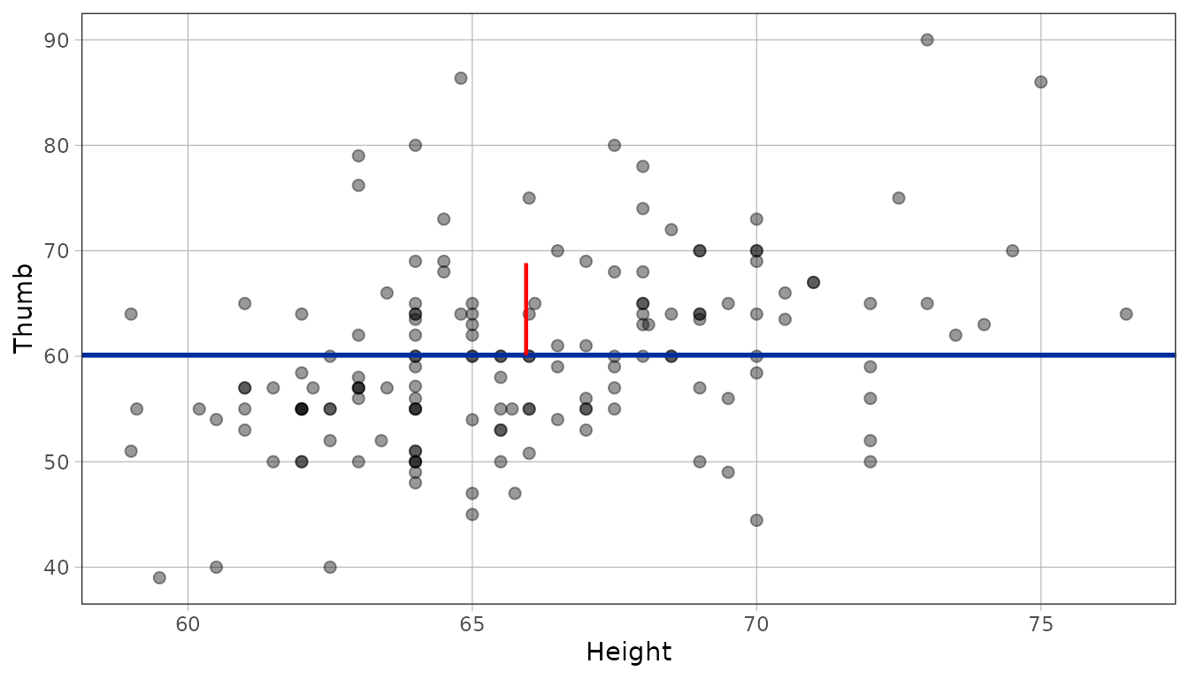
Where the error goes
The blue squares show the error left by the empty model. The red
squares show the error left after the model uses flipper length.
gf_reduce() draws the distance between the two predictions:
for each penguin, from the grand mean to the regression model’s
prediction.
gf_point(body_mass_kg ~ flipper_length_m, data = penguins_20) %>%
  gf_model(empty_20) %>%
  gf_model(sample_model) %>%
  gf_reduce(sample_model, color = "forestgreen")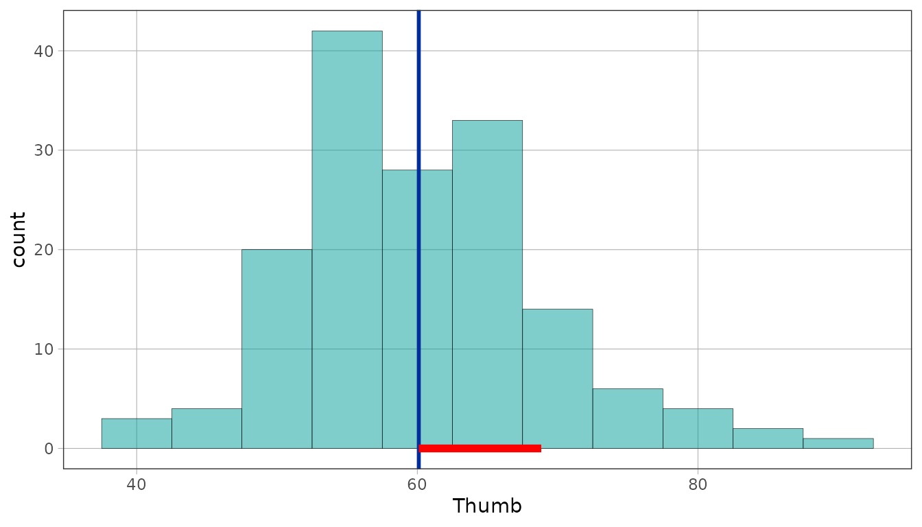
Across the whole sample, the blue square areas add up to the red areas plus the green areas. This identity holds for the sums, not for each penguin’s three squares on its own.
gf_point(body_mass_kg ~ flipper_length_m, data = penguins_20) %>%
  gf_model(sample_model) %>%
  gf_square_resid(empty_20, color = "dodgerblue") %>%
  gf_square_resid(sample_model, color = "firebrick") %>%
  gf_square_reduce(sample_model, color = "forestgreen")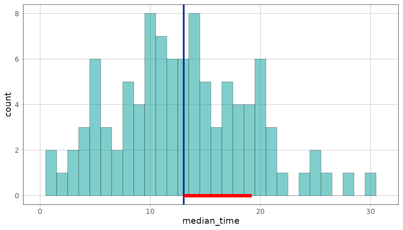
The direct ggplot2 counterparts are geom_square_resid(),
geom_reduce(), and geom_square_reduce(). The
stat_*() functions separate the statistical and drawing
choices: stat_resid() and stat_reduce()
default to segments, while geom = "square_resid" draws the
squared quantities as areas.
ggplot(penguins_20, aes(flipper_length_m, body_mass_kg)) +
  geom_point() +
  stat_resid(model = empty_20, geom = "square_resid", color = "dodgerblue") +
  stat_resid(model = sample_model, geom = "square_resid", color = "firebrick") +
  stat_reduce(model = sample_model, geom = "square_resid", color = "forestgreen")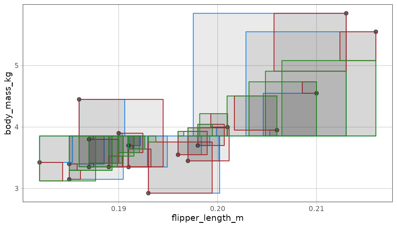
The sum of the green areas divided by the sum of the blue areas is
PRE, the same number supernova() puts in a table. Reduction
layers require an unweighted model with an intercept because that is
what makes the three sums of squares add up.
supernova(sample_model)
#>  Analysis of Variance Table (Type III SS)
#>  Model: body_mass_kg ~ flipper_length_m
#>
#>                              SS df    MS      F   PRE     p
#>  ----- --------------- | ------ -- ----- ------ ----- -----
#>  Model (error reduced) |  6.131  1 6.131 24.841 .5798 .0001
#>  Error (from model)    |  4.442 18 0.247
#>  ----- --------------- | ------ -- ----- ------ ----- -----
#>  Total (empty model)   | 10.573 19 0.556
The standard deviation as a typical residual
gf_sd_ruler() draws one standard deviation, anchored at
the mean. Under the empty model the residuals are deviations
from the mean, so the ruler is a picture of a typical one.
gf_point(Thumb ~ Height, data = Fingers, alpha = .4) %>%
  gf_model(lm(Thumb ~ NULL, data = Fingers)) %>%
  gf_sd_ruler(where = "mean")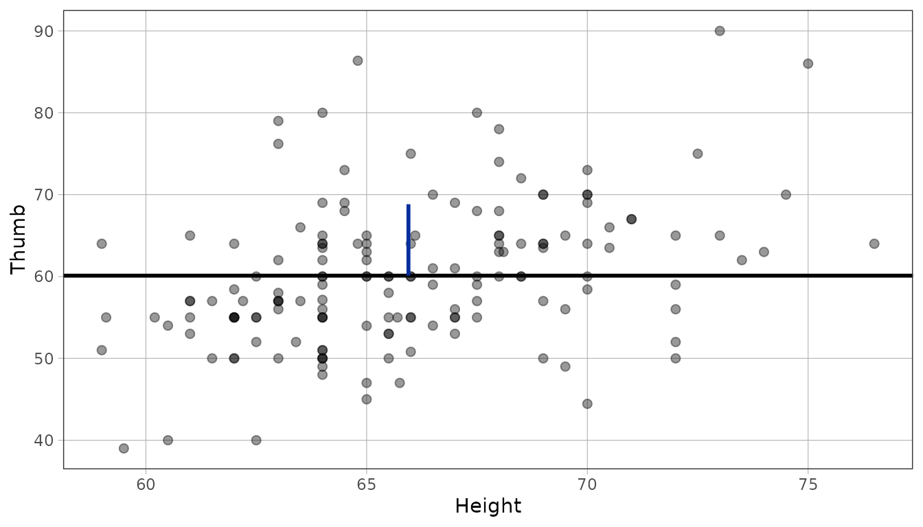
On a histogram the outcome is on the x-axis, so the ruler turns horizontal and runs along the baseline from the mean to one SD above it.
gf_histogram(~Thumb, data = Fingers, binwidth = 5) %>%
  gf_model(lm(Thumb ~ NULL, data = Fingers)) %>%
  gf_sd_ruler(color = "red", linewidth = 2)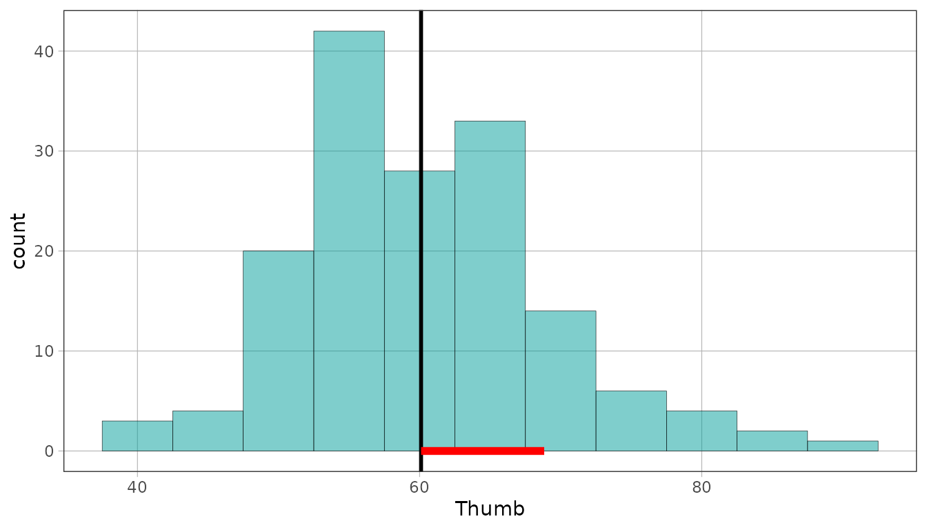
The ggplot2 layer is stat_sd_ruler(). It uses the same
panel calculation, so the choice of front door does not change what the
ruler measures.
ggplot(Fingers, aes(Height, Thumb)) +
  geom_point(alpha = .4) +
  stat_sd_ruler(where = "mean", color = "red", linewidth = 2)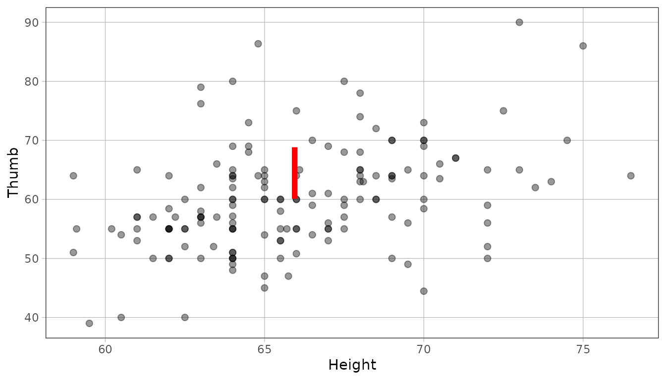
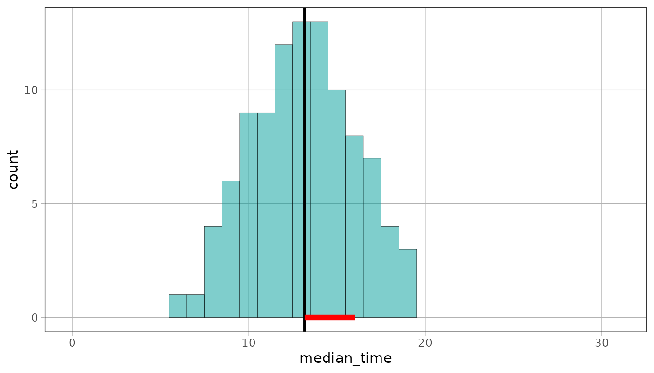
Two groups with the same mean and different spread get rulers of
different lengths, which is the comparison the ruler exists to make.
Zooming both to the same x range keeps them comparable.
coord_cartesian() does that by changing what you see;
gf_lims() would do it by discarding anything outside the
range, which is not what you want when the whole point is to compare
distributions.
set.seed(154)
no_feedback <- data.frame(median_time = round(rnorm(100, 13, 6), 1))
set.seed(141)
feedback <- data.frame(median_time = round(rnorm(100, 13, 3), 1))

gf_histogram(~median_time, data = no_feedback, binwidth = 1) %>%
  gf_refine(coord_cartesian(xlim = c(0, 31))) %>%
  gf_model(lm(median_time ~ NULL, data = no_feedback)) %>%
  gf_sd_ruler(color = "red", linewidth = 2)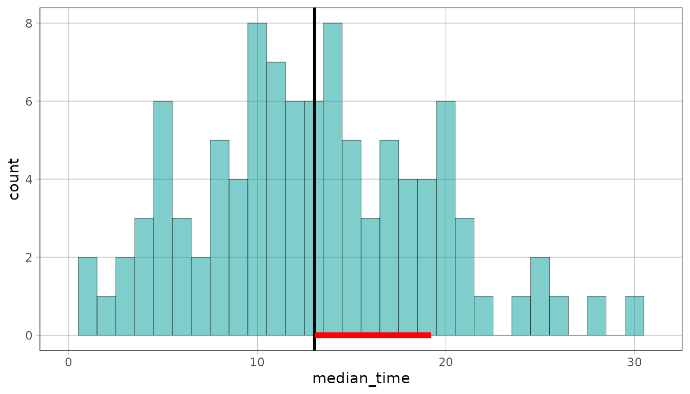
gf_histogram(~median_time, data = feedback, binwidth = 1) %>%
  gf_refine(coord_cartesian(xlim = c(0, 31))) %>%
  gf_model(lm(median_time ~ NULL, data = feedback)) %>%
  gf_sd_ruler(color = "red", linewidth = 2)